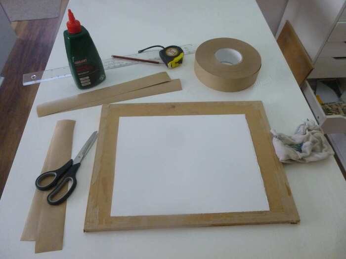
 Here's what you need. You need a painting board which is stiff. I use 1/2" (12.5 mm) MDF boards but you can also use thick plywood boards if you like. You can pay for an artist's drawing board if you're feeling flush - but you can get a lot of painting boards out of a sheet of MDF for not much money. The key is that it is thick enough to resist bending when wet. You also want some gummed brown tape of about an inch or more width - the type you get wet to stick down. Lastly, you need some white woodworker's glue - PVA glue, the type you'll find in a hardware shop. Here's the theory: dry paper will try to expand when it gets wet (as it does as you paint), which is the cause of the buckling up. If we can get that expansion out of the way before you paint, it won't happen again. So we're going to get the paper wet, let it expand, then fasten it down by its edges as it dries. The paper won't be able to contract again, leaving it 'pre-stretched' ready for you to get it wet again without curling up! So how to do it? First off, throw it in a sink or, if it's a bigger piece, in your bath. Then leave it there for half an hour or so. The aim is to get it really wet, so don't mess about with 30 seconds or a minute - throw it in, then go and think about getting the rest of the stuff together. Or have a cup of tea. Just don't hurry! Just one thing - make sure it's the right way up, so you can remember later - some papers are only 'sized' (coated ready to receive paint) on one side, so it's as well to make sure it's the right way up from the start. That means that it's the way up it was in a pad or, if it's a sheet of paper, the opposite side to the watermark indentations. When you have all your equipment ready, and the time is up, it's time to remove the paper. Lay it on a fabric towel and gently and quickly remove the excess water - you want to remove the drops but not the water within. Lay it on the board, the right way up. Now, squeeze a thin line of PVA glue all around the edge of the paper, staying as close to the edge as you can. To be clear, the glue is going on top of the paper, not on the board. Just keep it as close to the edges as you can. 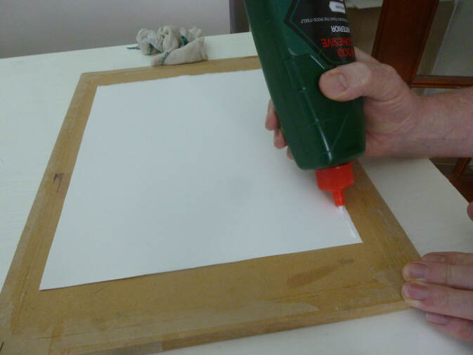 You see, the problem is, that gummed paper isn't what it used to be. Back in the day, it would be strong enough to hold the paper to the board as it dried. These days it's not up to the job. The glue will help the gummed paper hold the paper to the board - the glue dries as the paper does, and holds on. Once you have a thin bead all around the edge of the paper, moisten the gummed tape and stick the paper down at the edges with it, covering over that thin film of glue at the edges. 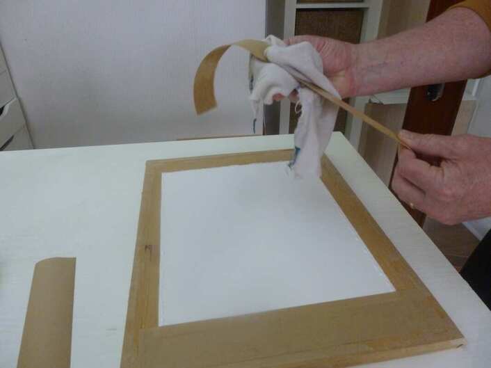 Because of the glue, you don't need a huge overlap; just enough to cover the glued area. The glue will try to squeeze out from the tape edges, and you can't afford to get the glue on the area you want to paint on, so start with a reasonable overlap (maybe 10 mm or 3/8") and you can maybe thin it down in future when you're well practised. (The glue acts as a permanent seal which won't let paint through - it'll stay as a white spot on the paper to the end of the painting if it gets on the paper). If any glue does threaten to get onto the paper you want to paint on, wipe it away with clean kitchen roll, swing outwards away from the paper. You'll be left with this: 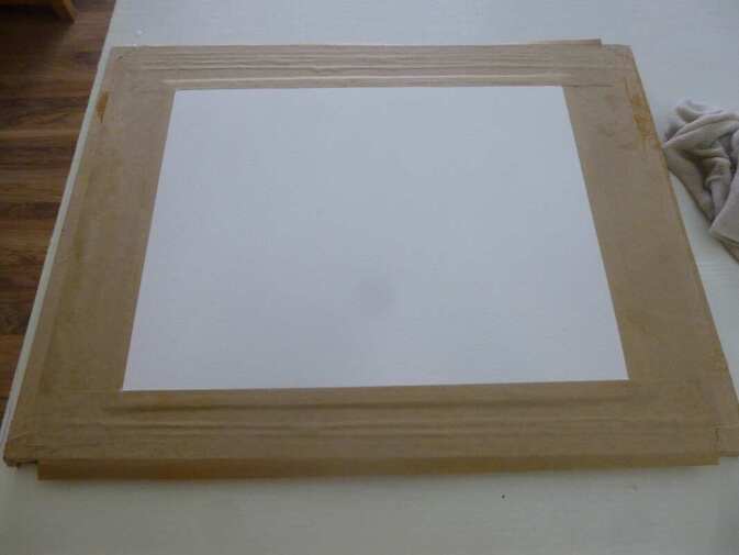 You can now just leave this to dry in a horizontal position. I recommend overnight, so pre-plan the paper you want to paint on. You'll also find it useful to have a few boards and to stretch paper in a 'production line' to do a few pieces at a time. The next day you'll find a taut, smooth and oh-so inviting piece of paper waiting for you. Better still, it'll help you paint by staying flat when you get it wet when you paint!
I stretch every bit of paper I use (Actually I use cotton rag 'paper' but everything is exactly the same). I use 300 lb heavyweight paper for my largest paintings - and I stretch that too. I paint very wet, and although this thick paper doesn't curl up without stretching, it does try to 'bow' along its length. Stretching it first stops that. If you don't want to do this procedure, you can use watercolour 'blocks', where the edges are gummed together. These are a 'half-way house', stopping the paper curling up as much when you paint on it, but in my opinion still not a substitute for proper stretching. So let me repeat my plea from earlier: please don't paint watercolour - don't even try it! - without stretching the paper first. You'll enjoy it so much more, and what's more, you'll be much more likely to succeed. Have fun on your lovely, flat and taut paper! If you've found this article helpful, or if you have any questions, please let me know. Maybe it'll tempt me to write more stuff on techniques! Cheers, Rob.
2 Comments
When we last looked at this painting we had completed the background. Now to crack on with the bridge and foreground! The most important element with the bridge and the foreground on the right is to maintain the light - so the first step to completing these elements is a very light wash to apply some colour without applying 'darkness'. The rock of the bridge, in real life, is a flat grey colour. This won't work in the painting, so to suggest warm sunlight across the scene we'll use a weak wash of warm raw sienna with a hint of the red colour in the sky - permanent rose. I followed this light wash with some shadows too. Here's the result of those first washes across these areas: 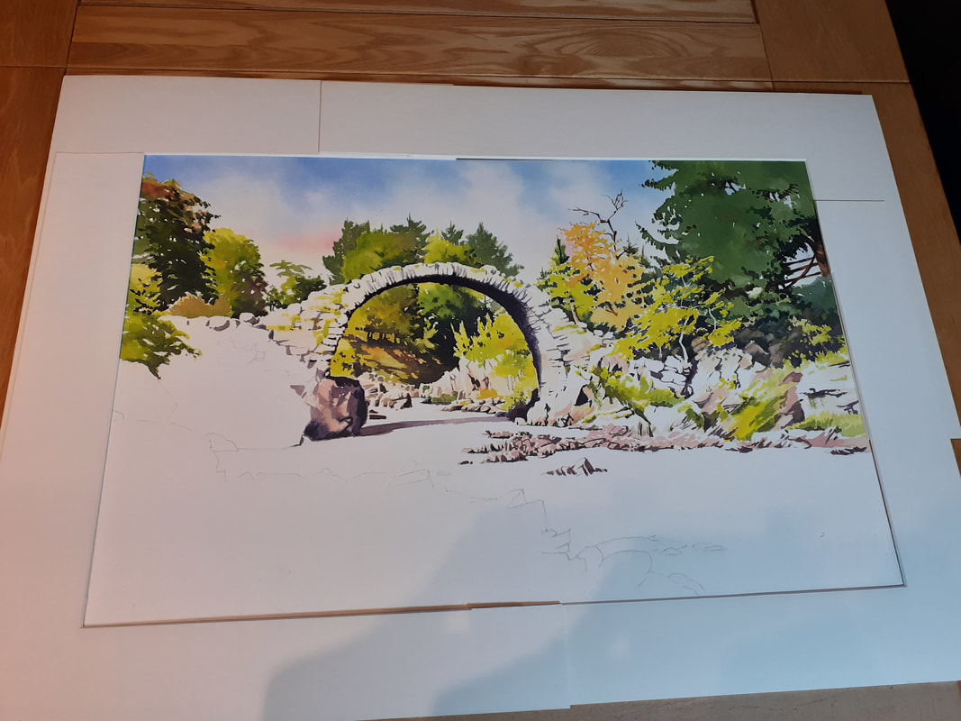 I carried this on with the rocks to the left. These rocks, in reality, are in deep shade, but this would be too dark. So I've used a bit of license to keep some light on them: 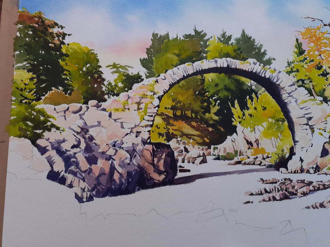 Now it's time to tackle the elephant in the room: the water. The pic above looks very weird, doesn't it? It's because the white is 'flat' as much as anything. So it was important to make sure that the water looks like a moving, active thing. To do this, I'm going to use a pencil to pull some lines of movement through the water then apply some masking fluid (liquid rubber) to the paper over them. These continuous lines will (I hope!) tie the body of the water into a single whole in the eye of the viewer. Once done, I then also mask the edges of the rocks, allowing a little overlap to allow a bright 'fringe' above the foreground rocks to suggest sunlight sparkling on the rocks. Now, I wet all the water area with clean water until the paper is soaking wet. This will keep the water area damp while I work, and allow washes to flow into each other, keeping the edges soft and natural in the water. Speed is of the essence here as once I start painting I have to finish before the paper starts to dry. I throw the dark washes into the wet area and stroke them into each other using primarily vertical brush strokes. The washes are very dark - partly to reflect the dark peaty colour to the water here in the Highlands but also to contrast with the lighter areas of land. Because the washes will dry lighter, I have to apply them really dark. It's a messy business! 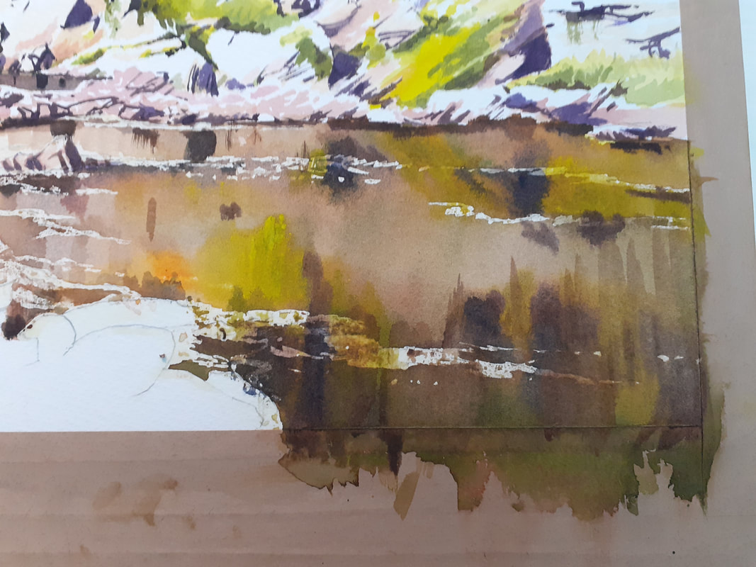 Once fully dry, I remove the rubber and then go back into the water areas with a scrubbing brush and a tissue to 'lift out' areas of light highlights where the bright rocks on the far side are reflecting. I also enhance some of the darks to make them darker where I think they need it Once finished, it's time for the foreground rocks. In real life they are incredibly complex, with lots of cracks and fissures, especially as the sun is from the side of the view and each crenellation casts a shadow! The effect, if I tried to copy it, would be to make the foreground rocks the main subject of the painting - and they aren't! So I'm going to simplify them a lot, with little more than some sunlit colours, a few big shadow areas, and a small amount of detail. I want to use them to draw the viewer into the painting and to make them look towards the bridge. So I'm going to highlight the lines in the rocks that help with that, and leave out the ones that don't: 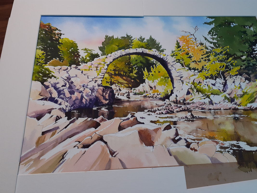 I'm going to leave it there - I have to do something to keep the suspense don't I?
All there's left to do is to add some detail to the foreground rocks and then fuss around the whole thing to refine details and make sure the tonal values are right. I'll hope to publish the finished thing tomorrow once I have a properly scanned pic that represents the original perfectly. I hope you've enjoyed the process, and I hope you like the painting when you see it soon! All the best, Rob. Managed to get a good crack at painting today, which was nice! Here we'll take the Carrbridge painting from just the sky painted to pretty much all the greenery finished! Greens are hard work because it's easy to end up with a whole painting of the same colour with little contrast or tone. Today involved a fair amount of mixing and testing to get what I wanted. The view above and through the bridge is pretty much just a sea of trees and it was important to make sure that there was plenty of light, colour and tone in play. I started out by masking the edge of the bridge so that I didn't have to worry about accidentally painting the stone of the bridge itself. Greens are notoriously staining and I didn't want to accidentally paint the bridge green! I started out by painting the trees above the bridge, ensuring that the lightest side was on the left with shade on the right: 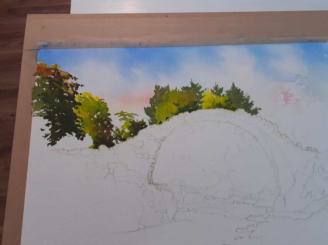 It looks weird like this, but will start to make more sense later. By the way, don't take the colours seriously, these are just quick snaps on my phone and the real painting's colours are different to these (although obviously they're fairly close!) I needed to get the greens above and below the bridge to match so I did them next: 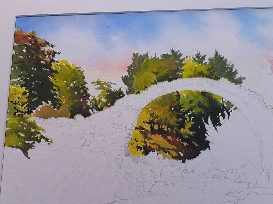 Now we get to see the idea of the painting, where the strong background colours and tones start to make the bridge stand out! Now, to set up a rhythm in the painting and give the appearance of complexity in the trees to the right of the bridge, I did a bit of 'negative painting' next: painting the dark background in first before adding the lighter colours in front. This is what it looked like at this stage - quite strange! 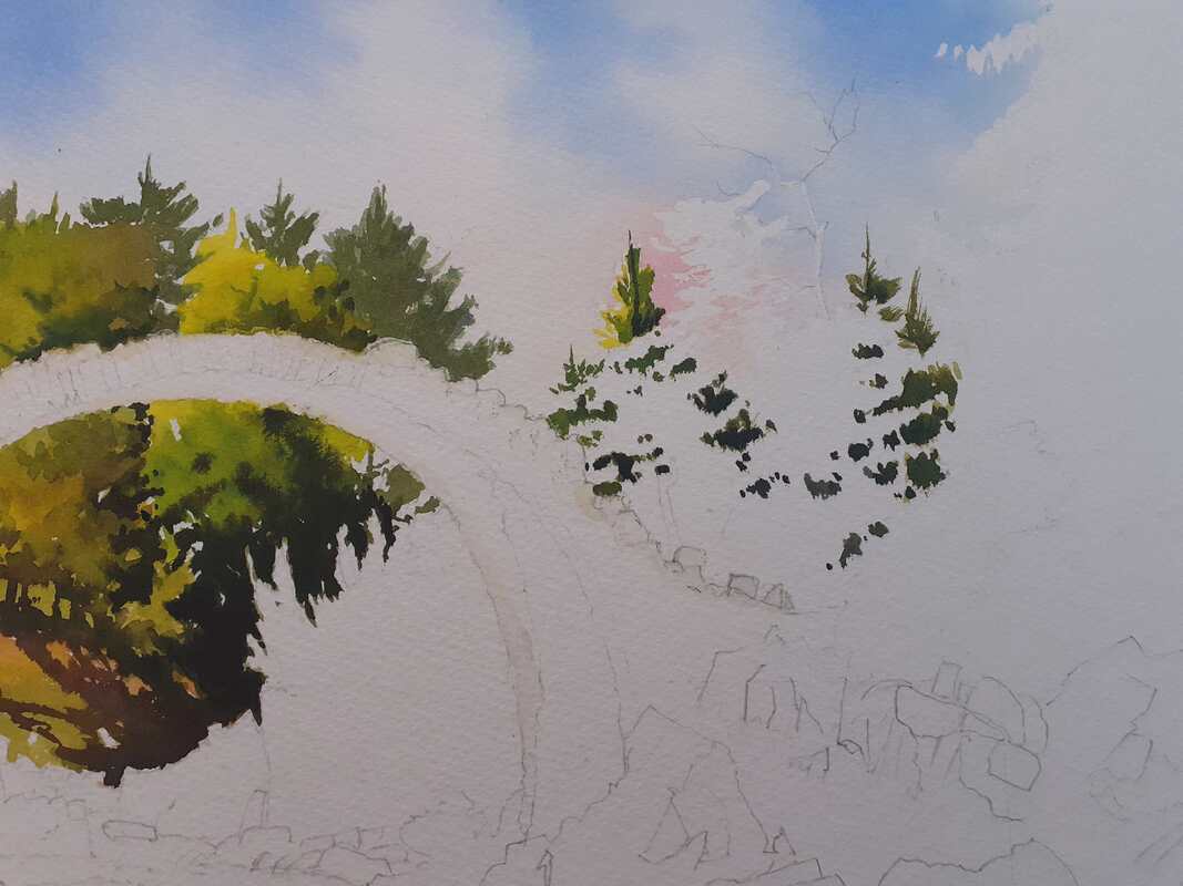 At this stage I'd painted in more of the darks (apart from some shadows that you'll see beneath the tree at right) so it was time to paint in the sunlit elements. The painting will fail or succeed on the strength of the sunlit areas which are to come. All the colours so far are strong and often dark. To work, it needs some serious lights. In watercolour, these need to be exaggerated or 'pushed'. So the colours for the lights are generally thin (to allow tbe white of the paper to shine through) and very bright. The idea is to throw a big contrast between the darker areas and brighter, sunlit passages. For those interested, the greens here were largely based on sap green, lemon yellow, Payne's Grey and transparent yellow, with some raw sienna and burnt sienna for warmth. I also mix in a little of the sky red (permanent rose) to make the greens sit comfortably under that sky. For warmth in the rocks and sunlit areas I use predominately the warm glow of raw sienna. So, with most of the greenery in place now, here's where it's been left on my desk: 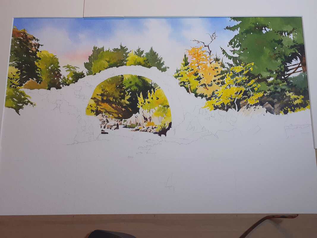 I hope that this will give enough brightness and contrast to give a strong background. I don't want too much detail, as I don't want it to compete with the bridge. Hopefully this will show it off - we'll see! I won't have much time for this tomorrow but hopefully I'll be back with more progress in a couple of days! All the best, Rob.
 It's always exciting starting a new painting, and this one's been a long time coming. I did the site visit and sketching work in early Autumn last year! Since then, I've been mainly doing commission work. This is traditionally the time of year that I get to work on new projects which will be new prints, and although I still have quite a commission load (which is great, and thank you so much to the many customers who have ordered commissions from us!) it's time to crack on!
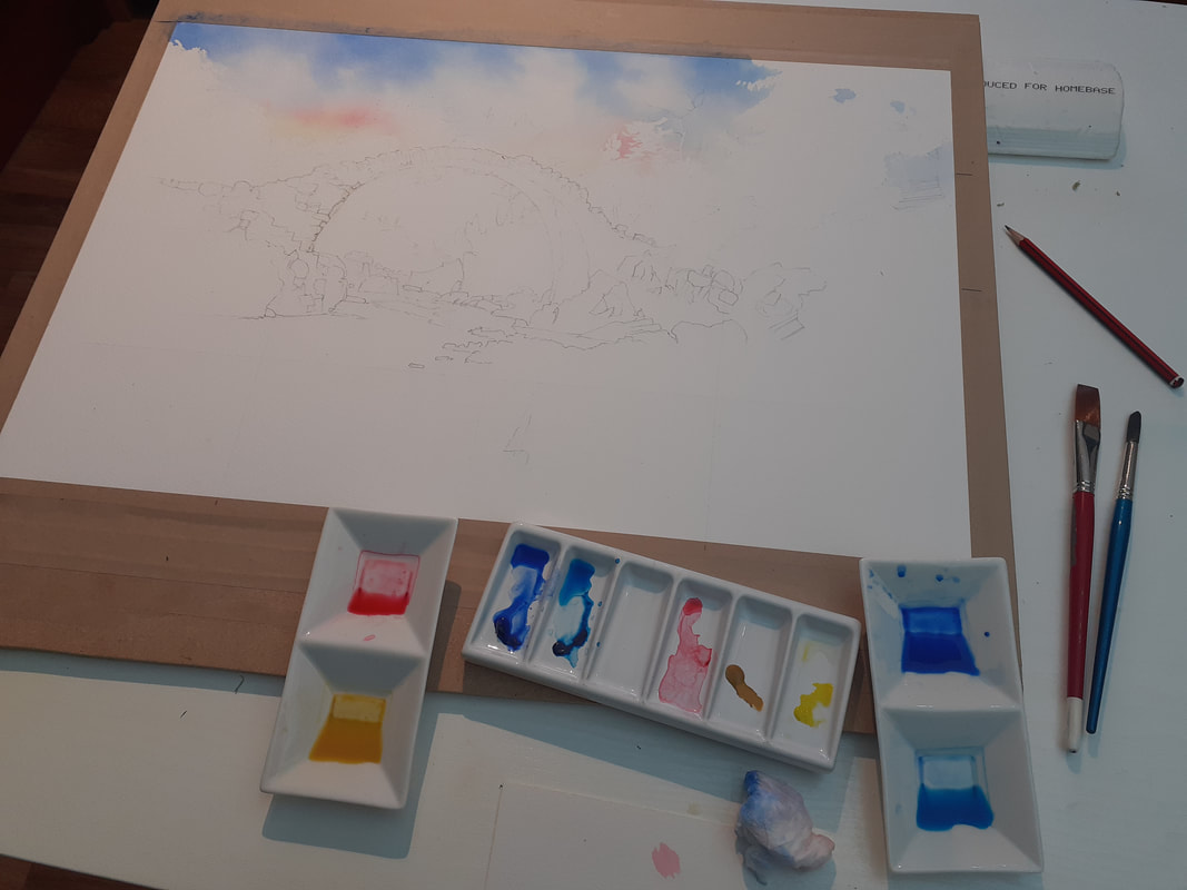
I started this piece on stretched Hi White Saunders Waterford NOT paper as normal. It's a half-sheet size which translates into my popular landscape image size of about 54 x 35 cm. Here you see the first few hours of the effort: I've divided the sheet into 16 squares to allow me to transfer the final layout sketch across to the paper and I've laid out most of the painting's important lines in pencil. After that, I've wetted the paper in the sky areas and floated pigment into those areas. At this point, I needed to start the greens and, since there will be so many of them and I don't want spare pigment drying out overnight, I decided to stop for the day. Here you can see the way that I work. The paper is stretched across an MDF board; so much cheaper than a commercial art board and lasts for years! I got the guy in the shop to cut a sheet into all the various sizes I want and so got about 7 different boards for about £15/$20. The board is propped at an angle with a strip of polystyrene coving left over from a DIY project. A single strip makes a great angle for painting and a double strip makes a great angle for drawing! This demonstrates my approach to commercial painting: the customer gets the finest products which will last, whilst I get away with the cheapest opportunities available! The pigments are mixed with water in sushi dishes, which make great palettes - note that the pigments are mainly single colours ready to mix together on the paper. I avoid mixing colours in palettes as much as possible as it can dull the colours and in the worst cases become mud! As many people at art groups will be familiar with, I have two brushes on the go - the blue one is for mixing colours and tones in the palette; I've tried the red colour out on a spare piece of paper at the bottom of the photo. The sky has been completed with my old faithful 3/4" flat brush. I've had it, as far as I can tell, most of my life. Most of the paint's gone from the handle and I'll admit that all the hairs no longer point in the same direction - but I love it. It stops me being too precise in large wash areas and I use it for any large area that I can. As the painting goes on, I'll cover lots of large areas with big brushes and gradually get finer - until the finest and darkest touches will go on with a No 2 round. For now, the possibilities here are endless and I'm looking forward to getting on with it tomorrow! If you've read the first two episodes of this little mini-series, I hope you're ready to finish the painting! Without further ado, let's get on with it! Here's where we want to be: 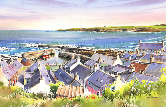 And here's where we got to last time, with the roofs of the houses painted (bear in mind that the photos of the work in progress are just quick snaps on my board):  What I didn't mention last time was the chimneys and the roof apexes which have been painted in in their colours. As mentioned previously, for sunlit stonework I tend to use an underpainting of yellow ochre and here it's been overpainted with either raw sienna for yellow claywork or light red for redder versions. The yellow ochre amd the white highlights help to give a sunlit effect throughout. I also keep the colours bright. Chimneys are often stained a dark colour in real life but it's not usually very pretty so I'm happy to keep the colours bright in my painting! I now have to confess that I didn't take as many photos of the last stages as I would have liked, so please bear with me through the words, which I'll keep as brief as I can. The next stage is to paint in the shadows throughout the painting. Why do them first? It's because the application of shadows over already painted passages will blur the detail and cause colours to run, which I don't want. By applying the shadows first, and painting colours over the top with a light touch so as not to disturb the paint, this can be reduced - so I put the shadows in first. It does take a little practice to work out how strong to make the shadow washes, especially as they fade a bit as they dry. It helps to make a strong wash - strong enough to be almost black for the densest shadows and then scoop some of it out to make a series of about 3 progressively weaker washes. These will then be the same colour - so will sit well together - but help you differentiate between lighter and darker shadows. My usual shadow mix is the sky blue (normally ultramarine), the sky red, (normally rose madder) to make a bluey-purple, greyed with a little burnt sienna. The sienna is powerful in this mix, so I find it better to mix the purple then add brown a bit at a time until the right degree of grey is obtained. How much you grey it is up to you. I prefer to keep my shadows purple-tinged for colour effect but if you add a bit more burnt sienna you can make a flat grey - it's personal preference! I apply the shadow colours with a round brush in a 'drawing with the brush' style. I bear in mind that the stronger the sunlight, the darker the shadows. But equally, I also remember that shadows still have some light. For example, the left hand walls of the houses here will be quite dark with the sun coming from the right - unless they stand opposite a white wall from the house opposite, which will illuminate the shadow area with reflected light. It all makes sense if you think about it - and as usual close observation of the subject is the key! Having done the shadows, it is a simple matter to go around and lay colours for the houses and streets over them. I also add windows, drainpipes etc at this stage. Before commencing either of these stages, I applied masking fluid to protect any foreground objects like trees and leaves so, once the shadows, colours and details have been applied to the houses, I remove that. We've now got to this stage: Only really the vegetation in the foreground to do! 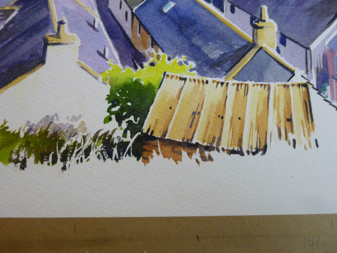 I hope that you will see that the level of detail I have applied in the stages so far is not very great. It's a mistake to think that detail is everything, I think. Rather, a few carefully placed squiggles do a better job of suggesting the detail the viewer's brain thinks is there. Moving on to the greenery in the foreground, you see here a favourite 'trick' of mine, which is to split it into sections and use masking fluid to suggest blades of grass or leaves in the nearer vegetation. With the masking fluid in place, I add the furthest greens, adding shadow mix as I get lower. This darkness makes a great contrast with the lighter grass leaves I will paint later and suggest a mass of leaves at the same time! To give a 3-D effect to the green colours, I'd suggest you need at least 3 tones. So, for trees, I mix 3 washes: a light yellow wash, usually with lemon yellow featuring strongly. The mid-green will be either sap green knocked back with raw sienna or another combination such as Payne's Grey with Transparent Yellow. Finally, I mix a dark green by adding either shadow colour or more Payne's grey. I start by laying in a blob of the lightest wash on the sunlit side, mixing it wet in wet with the middle green for the 'middle' of the tree, and then adding dark once the tree is on its way to drying (to stop the dark spreading too far). By leaving those white 'sparkles' of light on the sunny side we can create the effect of vegetation glimmering in the light, with warm, dense shadows. Finally, the foreground grassy area is painted. Because this is foreground, I want warm colours (red-biased) so mix warm and dense green washes, adding a little sky red and light red to the mixes. I mask a few dots for flowers (even if they're not there in the real world - life's too short to have no flowers!) and then apply the foreground wet-in-wet. I don't want too much detail in the foreground, just a suggestion of detail and warm flowing colours that suggest that the vegetation is close to us. By suppressing detail we force the viewer's eye elsewhere and apply a metaphorical 'nothing to see here' label - so their eye goes up to the main picture, where we want it! In particular, you will see that I give almost no detail on the bottom few centimetres. Once this wet-in-wet wash is dry, I go back with a few dark hints to suggest shadows between leaves and blades of grass. Here 'less is more' is the secret, as too much of it will darken the foreground and give it too much emphasis, as well as spoiling the effect. And that's it! We're done! At this stage I normally go and leave the painting overnight without any further thought. A glass of wine helps here (notice a theme here!?!). The next day I come back with a fresh eye. Mostly I now just tidy up detail and add some more contrast where needed - stronger darks, lighter lights and sometimes a blob of permanent white gouache if necessary. But then I leave it. Too much fiddling spoils the 'immediacy' and spontaneity of the painting, so it's best left as it is. And here's the final result in better lighting conditions: 'Sandend Harbour from the Brae', watercolour, 54 x 35 cm. The original and prints are available to buy - see www.robwighamwatercolours.com/available-work.html for details! I hope you have enjoyed this little series and have found it helpful. All the best, Rob.  Last post we painted the sky and the distant headland of this scene. This time we're going to take over from where we left off, painting the seas and starting the village and harbour itself. I'll try to keep it as brief as I can - if I miss something and you'd like to go into more detail, please let me know! 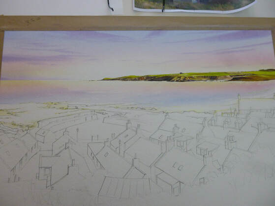 The first thing to do is to re-establish the washes used for the sky and underpaint the water area. For this I masked out the white wave areas first around the harbour and rocks, then re-wet the water area with clean water. I then laid in the sky washes, upside-down and stronger than the sky itself (because the blue water washes will mainly cover these colours up). This underpainting means that the blue 'sea' wash will take on these underlying colours and sit naturally beneath the sky. Next, I masked the surf breakers themselves. Masking after doing the underpainting means that the 'whites' of the surf will show subtle sky colours - a good thing! I use a very small round brush for this as masking can appear quite clumsy when the fluid is removed, and any masked mark ends up being twice as big as you thought it would be! Finally, I mixed the washes for the sea. The first was a pure ultramarine blue. Initially it wasn't too strong, as it would be used for the distance. I would strengthen it with pure pigment as we came nearer the shore. Next, I made a wash of Pthalo blue (green shade) for the shallower water. As usual, where I can I like to make pure washes and mix them on the paper - I think it keeps the colours brighter! The painting of the water doesn't take long at all - the first aim is to cover the area with colour. I lay the blue washes in, fainter at first, by the horizon, strengthening them as they come closer. Before I get to the shallows, I start to add Pthalo blue. All this is done with a loaded round brush with long horizontal strokes, working down the dry paper. As I reach the shallows, I start to add both raw sienna and rose madder. I need to be careful here, as adding these colours can make the wash thick and dark - the opposite of what the water should look like! The secret is to keep them light, and stretch the colours across the white paper to keep them bright. I drop a few more strokes of stronger colour here and there and let it dry, before removing the masking fluid from the surf areas. Now it's time to add some harbour walls and rocks. These are done on dry paper, with strong washes of yellow ochre first (as an underpainting to suggest sunlit areas)), shadow colour made from blue, madder and burnt sienna for shadow colour (again as an underpainting) and then some raw and burnt umber added over the top for the solid shapes. The result, with some nice contrast with the white surf, is shown below (please bear with the dodgy photos, they're done as a quick sideline during the painting with no thought for lighting etc): 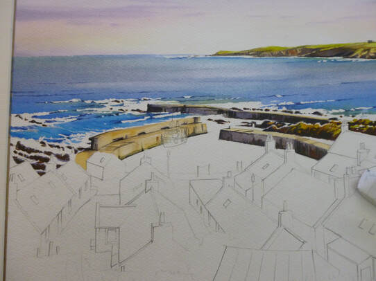 To paint the water in the harbour, we'll exaggerate the difference between the rough waters of the breakers and the smooth water of the harbour - so reflections become important. I mask around the houses and the boat, then paint in the harbour with a light sky blue of ultramarine with a little rose madder. With that still wet, I start adding the dark harbour colours , plus a fair amount of dark green (sap green plus burnt sienna) to the water below the walls - leaving a white gap where the boat is. This runs softly into the water, becoming diluted but leaving soft edges. I keep adding the pigment until the reflections are dark enough. While the area is still wet, I flood in some red under the boat, having masked a few white areas for bright reflections: 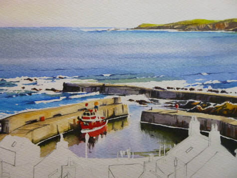 Phew! That's the water done. Maybe it's my background, worrying about watercolour skies and the difficulty of painting water, but at this point I always feel like the painting's going to work: the difficulties and 'unknowns' are behind me! At this point I generally clean all the palettes and refresh all the blobs of paint to get ready for the land. I do the roofs first. To do the roofs, I use 3 colours: ultramarine, rose madder and some burnt sienna. These three colours will give blues, pinks and greys in enough variety to make a rich set of roofs. Some of them are red (clay) tiles, of course, and then a mix of light red and raw sienna works well. I also need to colour in the chimneys and clay apex tiles in raw sienna, occasionally with dabs of light red and rose madder. Before I apply the colours I apply shadows as before. It's always best to apply shadows first, otherwise the shadow colour will blur the detail later. All through the painting process, I need to remember that the light is coming from the right, so I leave a small line of white paper unpainted to indicate the twinkle of light on the right side of every object. If that sounds complex, once you get used to it, it becomes second nature (honest!) So this is where we've got to! 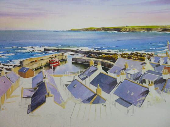 OK, we've covered a lot of ground, and we only need to add the bodies of the houses, foreground and detail to finish. For now, treat yourself to a glass of wine (I did!) and we'll finish it next time. Thanks for hanging in there - see you soon, Rob. I promised to give a step-by-step of one of my paintings soon, and for once I remembered to take photographs at each stage of my 'Sandend Harbour from the Brae'. The painting was painted at a size of 53 x 35 cm and done from a collection of sketches I made recently on the path above Sandend village. I also took some reference photographs but, as usual, I tried to make minimal use of them. I find that I produce better paintings when I work from my sketches, so I only use the photos when I need a reminder of something I haven't covered in the sketches. So for this post and the ones that follow, I'm going to skip those stages and go straight to the painting, doing a bit at a time until we've finished the whole thing! A piece of the cotton 'paper' I use, Saunders Waterford Hi White 640g was stretched and I then drew a grid of lines lightly across it, dividing the paper into quarters. I do this to transfer my final layout sketch onto the full-size painting. I lightly draw in the main lines of the painting by eye from the layout sketch:  Had I been cleverer, I would have remembered to only do the top half of the painting's drawing at the start. I always get carried away and draw the whole picture out, but this has the disadvantage of resulting in lots of smudged pencil as I work on the painting. Much better to restrict it to the top half and draw the rest in once the top is painted! On to the painting. I usually do the sky first and then work down the painting. This isn't always the case, but I find it easiest to work on the paintings a section at the time. To paint the sky, I mixed some washes first. Things happen fast when working wet-in-wet, so it makes life a lot easier to have washes ready mixed first. I mixed a 50/50 wash of lemon yellow and raw sienna. This is to produce a warm yellow at the bottom of the sky; the lemon yellow serves to keep it bright. I also mixed a wash of rose madder. I know it fades as it dries, so this wash looked stronger than the yellow one. A blue wash of light ultramarine finished the main sky colours; I also mixed a stronger purple from the blue and rose for the clouds. With the washes ready, I masked the top of the sea with a piece of masking tape then washed clean water all over the sky area. On this thick paper, it took a few lashings of water to get it properly wet. I like the heavy paper as it stays moist for a long time, allowing me time to add extra details at leisure (a thin paper dries faster and everything becomes a race against time). It is also good for demonstration work as I can chat about what I'm doing as I go, without fear of the wash drying on me. Incidentally, the reason I wet the paper first is so that there are no hard edges, with the sky colours mixing and spreading across the damp paper. With the paper wringing wet, I use my 3/4" flat brush to lay in a light wash of yellow at the base of the sky, just above the land and sea. It will run down on the gently tilted board but will be very weak when it reaches the bottom, preserving a light glow just above the horizon. I need to consider preserving the painting's 'inner light' at all stages and in everything I do! I keep strengthening the yellow until it looks just a little too yellow: it will fade a little as it dries, so most colours need to be put on stronger than I want them. The colours are also diluted by the water on the paper, which contributes to the fading. Happy with the yellow, I apply the red - again with slashing horizontal strokes - keeping away from the area of light at the headland, which I leave as white paper to produce the 'glow'. The red fades more than the yellow so as I apply it I have to keep that in mind and apply a strong band of red. I work it into the yellow with slashing x-shaped strokes across the paper to achieve a blend from yellow through orange into the red. A clean of the brush and I do the same thing with the blue, laying it into the top of the red and working up the paper. The first wash of blue is quite weak as the colour isn't strong low down in the sky. As I go up towards the top I add a little more pigment to the wash to strengthen the colour with each new stroke. The background colour of the sky is complete! It's now time to do the clouds but the paper is still wringing wet. If I applied the cloud colour when it was too wet, the colour would spread too far in the sky and just make it dull. I want it to spread to avoid hard edges to the cloud, but not too far! So I wait for a few minutes until the paper is just a little less wet but still good and moist. Then, using the flat brush again but turned at an angle so that it will produce thin marks, I stroke in the clouds. It's important to make sure that the cloud colour is strong and dark enough to stand out against the sky behind, but at the same time not so strong that it makes the sky dark. In this painting the sky needs to be light, or the overall painting will appear too dark, so I kept the clouds as light as I could. Compositionally, it's also a good idea, in a 'busy' painting like this one, to keep the sky simple. And so it is! 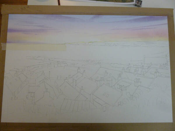 The next stage was to paint the headland. I mixed a wash of sap green, knocked back with a little raw sienna to make is a more realistic colour and another wash of stronger neat raw sienna. With a pointed round brush of size 8, I then painted the green colour strongly along the top of the headland and the raw sienna along the bottom, down to the waterline. This produces a wet-in-wet mix as the green at the top mixed with the yellow. While that dried, I added some lemon yellow to brighten the green in places and once it was just moist, I started to add burnt sienna into the rocky areas to give it that red colour. I kept adding this as the headland dried, which allowed me to gradually add shape to the land. This is a useful method because, as I don't have total control of the pigment, I can suggest detail without actually painting it. Finally, I added some of the blue to the burnt sienna together with a little of the rose madder to make a shadow colour which I applied into the red-brown areas. At this stage the headland was dry, so the final shaping was done with progressively darker mixes of the shadow colour, until it was almost black: 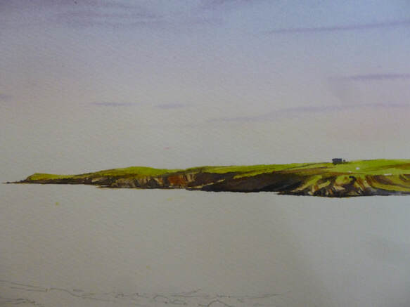 I'm going to leave it there for this post to avoid it getting over-long. If all the words give the impression that the painting took a long time, it didn't. The actual painting work so far took only about half an hour - it just takes a lot of words to describe it! I hope you enjoyed the start to the painting - next time we'll be painting the sea and making a start on the houses! All the best for now, Rob. So having promised over a year ago to write more blog posts, I seem to have written very little! I promise to rectify that now, and produce more posts both on our work and some of the things behind it. I've been asked a few times to show some of the equipment that I use to paint - so for an opening blog, here goes! The stuff in the picture below is almost everything I use to produce my paintings; there are a couple more brushes and lots more paint colours in my collection, but these are a good sample. Today I'll start with the paints and come back to the brushes in another post. 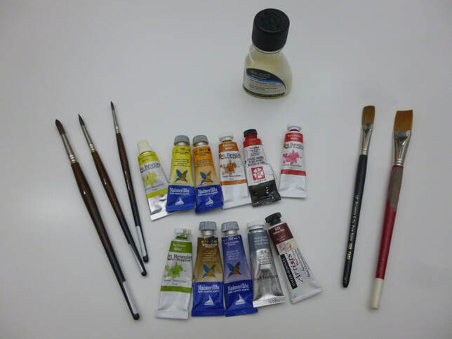 As you might imagine, my paints are pretty important to me. After the paper, I think they're the second most important element of equipment a watercolourist needs, so let's have a quick look through my paint drawers! They're all artist's (professional) quality pigments, which means that they're very finely ground minerals which produce a consistent wash and they're made from high quality ingredients. All the pigments are classified either lightfast or very lightfast, as this is important to me: I sell my work and the customer deserves the best and lasting quality. As you can tell, I don't have any loyalty to any particular manufacturer and there are a reasonable selection here. If I had to choose a particular favourite range of paints it would probably be MaimeriBlu, a range made in Italy and not as common as some in the UK. These colours are very pure, quite strong and very beautifully ground. They include my favourite-ever pigment which is light ultramarine - shown at centre on the bottom row. I love that azure blue which has not a hint of grey. To see it properly you'd need to own one of my originals and, chances are, if it's a blue sky then that's it - I use it whenever I can! As you'll see, MaimeriBlu makes up quite a lot of my range. Now, I'm a great believer in the fact that a big name doesn't guarantee good quality; all my paints have passed my own tests for quality and usability and you might notice from the photo that some of them come from the Ken Bromley range. These are of surprisingly good quality, considering that they're an 'own-make' from a big UK online art shop. I find that they are very good for many of my colour palette; where I buy more expensive paints it's because they have a special quality that I value. As you'll see here, three of my staples (raw sienna (a lovely warm yellow), rose madder (a gentle pink) and sap green (an unnaturally vivid green) come from the Ken Bromley range. Where you see purples in my skies they will usually be a mixture of light ultramarine and rose madder. Rose madder is an old-fashioned colour which has more subtlety than strength. It makes a lovely pink on its own and gorgeous purples when mixed; the old formulation was fugitive (ie not lightfast) but the modern formulation means that this lovely colour is a responsible choice for those that sell their work. I mentioned that sap green was an unnatural colour, so why do I use it? The answer lies in the fact that it can be mixed with a variety of other colours to mix a wide variety of greens. The same applies to my other two greens: Hooker's Green and viridian. Also shown in the pic (fourth from left, bottom row) is Payne's grey - this time from the Windsor and Newton range. This is a dark grey with a blueish tinge and is there because, in paintings with lots of greens, it's another good way of mixing warm but different greens. I find it goes extremely well with transparent yellow to produce a range of greens that run from a yellow sickly-green to a rich dark green. Again, this basic mix can be changed by the addition of a third colour, such as a red to produce a warm and luxuriant green or burnt sienna to produce a rich dark. There are lots of ways to make greens, but sap green-based, viridian-based and Payne's Grey-based are my favourites. The variety helps to keep interest in a large are of greens such as were included in my recent painting 'Craigmin Bridge'. The two colours I use most for greys and blacks are burnt sienna and burnt umber which, when mixed with blues give a flat grey. An artist's definition of a grey is something along the lines of a mix of opposite colours on the colour wheel, which means there are many greys which can be used, depending on their setting in the painting. Whichever you use, the addition of this flat grey will make it darker, and I find it convenient to use that method often within a painting. A dense black can also be made by mixing Indian Red (at bottom right from the Daler Rowney range) with a dark blue such as Indigo. The last ones of the colours above are those I use for highlight colours - often the brightly-dressed people in my paintings! There's Pyrrol Red from the Daniel Smith range (I have quite a few more reds from various manufacturers in the range) and the incredibly versatile lemon yellow (here by Ken Bromley but also by MaimeriBlu). Lemon Yellow is perfect for suggesting sunlight by intensifying greens and for underpainting areas of ground that will be sunlit when overpainted. So there you have a quick canter through my pigments and a little bit about how I use them. I hope you enjoyed it and found it useful! I have a lot more colours than the ones mentioned here (I mentioned earlier that I have 2 drawers-full, totalling about 60 different colours) but the ones I've discussed here form a backbone of my palette. Indeed, it's often best for colour harmony to restrict the number of colours in a painting to just a few - so I usually end up using just a few at a time. One of the most important things about watercolour is to understand how your colours mix with each other and using a limited palette is a good way to learn! OK, in a future post I'll come back to brushes, paper and other bits and pieces. Before that, though, I hope to get together a walk-through of how I produce a painting from beginning to end over a few blog posts. The painting is almost complete on my board, and for once I've remembered to take photos at every stage! I hope you'll see the painting very soon and the blog not long after! All the best, for now, Rob.  It's finally here! I've been working on this improved website design for what seems like months (OK, it has been months), and today we've finally launched it. It's live to look at!
Here is a brief list of the improvements: Each page no longer opens in a new window so you can navigate easily with the forward and back buttons of your browser. Each painting and each print gets a page of its own, so you can get to them quickly. Each painting or print now has a button which allows you to contact us from right there. The Coastline, Landscape and Aviation galleries feature all the paintings and are good for a browse through. The Prints and 'Available Work' galleries are more tightly organised to enable you to find works and places quickly. For example, the prints of Cullen can now be found in the 'Findochty to Cullen' part of the Coastline Gallery. There are lots of other, more minor tweaks too. Please enjoy a look around our new website. We've built over 120 new pages to create it, and so there's bound to be some mistakes somewhere. If you find any, please do let us know! Thanks, Rob and Sharon. In response to a few questions about painting water, and particularly crashing surf and big waves, I'm going to make a plea. It's not open to all of us to get out there and observe nature at work, but when we can, we really should! If you want to paint big water, you really need to understand the way it moves and why. You could study the physics for a long time, but the best way, I think, is to watch the water at work. 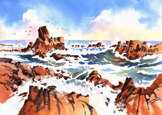 The point I'm making here is not how to paint water, but to get out there and watch it. As it 'heaves' up in one place, it pulls back from another, but there are always lines you can see relating to the overall pattern, they move all the time, but here, in this quick study I did for an art group class of the rocks off the caravan site at Findochty, you can see a single line of wave running from the top of the foreground rocks at left to the top of the foreground rocks on the right. This single line, unnoticed unless you're looking, holds the water together. In front of it, the water is swelling and pouring over the close rocks. Behind, the water has been sucked away ready for the big wave that's currently breaking behind it. Using these simple thoughts about the water's movements, we as artists can express our thoughts on the movement of the waves while avoiding that broken effect that makes them look artificial. So, if you can, get out there and watch the water, making big lines on a sketch pad as you see the big lines form. Then go and paint!!
|
AuthorA professional artist living and working in the beautiful north of Scotland. My work is realistic and quite traditional, though strongly interpretational in nature. My inspiration is the beauty of Nature, and the wonderful colours and moods she shows everywhere. Archives
April 2022
Categories |
 RSS Feed