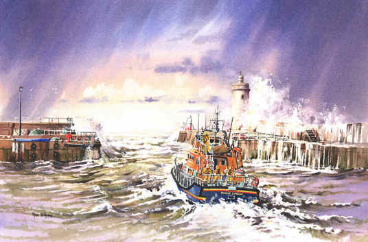
 I've not added anything to this blog in quite a while - sorry about that! Anyway, here we are back in action... This is my latest painting: 'Our Town's Faith, Hope and Glory', a name suggested by one of the inhabitants of Buckie, on the north-east coast of Scotland, whose harbour stars in this painting. I had initially intended a painting of a trawler leaving port (Buckie is a working port) but as I was skecthing the harbour entrance, the lifeboat put to sea on a training exercise. This painting was born at that moment! Once I had the idea for the lifeboat, I couldn't make do with the calm sea as I wanted to reflect the fact that these crew members stand into danger in all sorts of weathers, and the weather and sea around here can be pretty bad! Although the view here is within the harbour, there's still some swell from outside. The majority of the dramatic effect here comes from the waves we can't see crashing over the walls. I loved doing these waves and spray, and I'm sure they'll be featuring again soon. For this painting, I'm glad to say that we'll be donating a framed copy to the Buckie Lifeboat crew in early March, and they've invited us over to the station for a look around. I'm delighted that the finished painting pays tribute to the bravery of the crews - especially important in this coastal region. I'll be staying with Buckie for the next painting too...
1 Comment
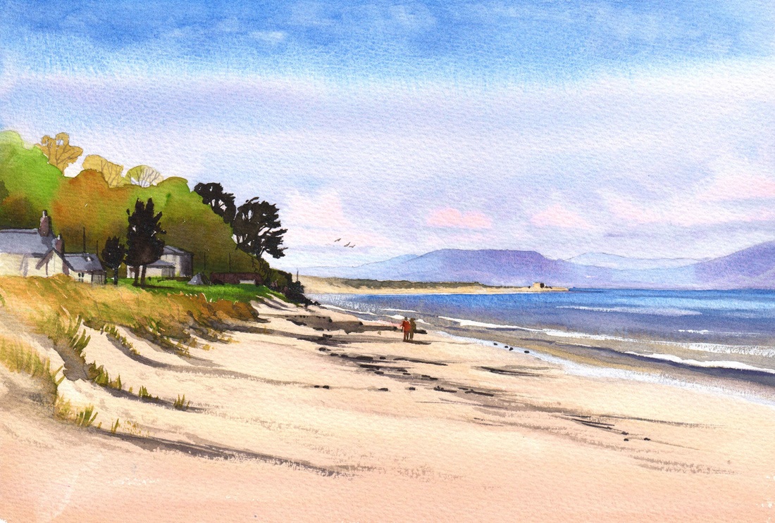
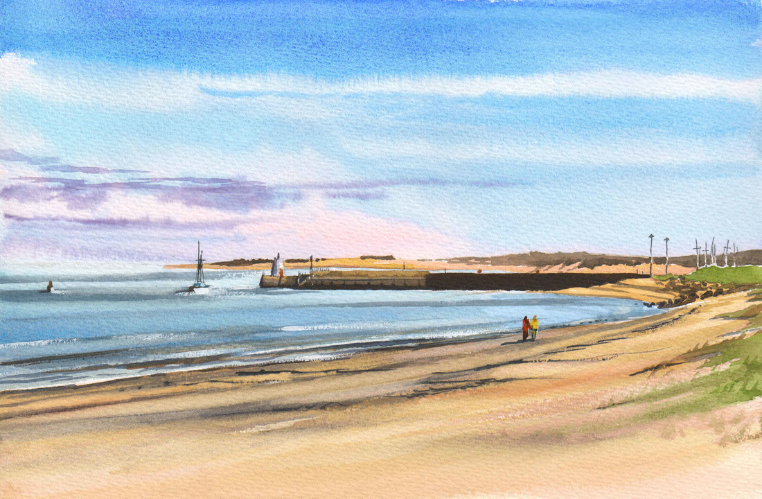
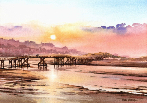 My work recently has featured a lot of bright, sunny days, with quite a lot 'going on'. I thought it was time for a return to a different atmosphere, and there's nothing I like painting more than a gentle and peaceful sunset! For this I have returned to a favourite spot of mine - Lossiemouth, a small town on the Moray Firth coast just a few miles from where I live. here, we are looking across the River Lossie on its final run to the sea: the river turns right after it flows under the bridge and empties into the sea by the edge of the town just behind the sand dune on the right of the painting. The Moray Firth coast gets its share of mist and fog, mainly due to the Haar, a fog which rolls in off the sea and varies from a light mist to a real 'pea-souper!' Here I have applied only a light mist, allowing the sunset to shine through, lending its wonderful colours to the low cloud and reflecting them in the river and on the sand. The town and distant buildings around the harbour are rendered indistinct by the mist - one of my favourite aspects of watercolour! I hope this all gives an overall impression of serenity and harmony, as the river flows gently past and the sun shines softly through the mist. I enjoyed getting a little atmospheric! The original is available, and prints will be available soon - see my Coastline Gallery for details. Wow - it seems ages since I last posted here. Sorry, there's been lots going on! But I've been busy with more paintings of the beautiful coastline around where I live: 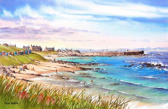 This is the latest one: 'Hopeman Harbour from the Headland', watercolour, 52 x 34 cm - it's in my Coastline Gallery. I'm really enjoying painting the local landscapes at this larger size - there's so much opportunity for detail and atmosphere! I think you can probably tell that what attracted me to this scene (apart from the beautiful view) was the variety of colours in the water. Hopeman beach is quite rocky, and I wanted to capture the contrast between the greeny-blues of the sandy bottom against the submerged rocks and seaweed, with the sand under the water lit up by the sunshine. I really enjoyed painting this sea! The scene is also very close to life, and I hope I've captured the essence of this pretty little seaside town and harbour here on the Moray Firth.
I think this will be my last Hopeman scene for a while - this has really wetted my appetite for painting more of the stunning views along this Jurassic coastline! The original of this painting is available, as well as prints in two sizes. This is one of my favourite ways to present a scene - 2 views painted from the same spot! In the paintings above, we are looking first left and then right from a place on Central Beach at Nairn. The originals are sold but both paintings are available in print form at just a little less than original size - the prints are around 32 x 21 cm each. They come mounted ready to fit a 50 x 40 cm frame and look absolutely fantastic (IMHO!) together. Check out My Landscape Prints for details and price!
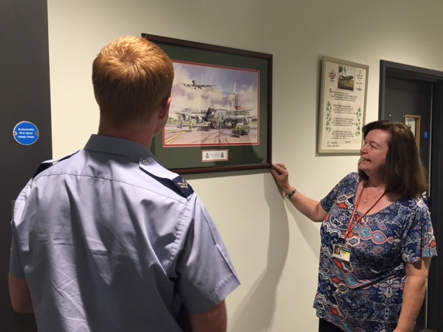
As you will read on my 'what you get' page, I put a huge amount of effort and quality into all the work I produce, from the quality of the paint, paper and ink that I use to the care and attention to detail I put into each piece of work. So it's nice to get good feedback! I thought I'd share these photos of one of my works - '51 Squadron Centenary 2016' - hanging in the Squadron building depicted in the painting. I was honoured to be commissioned to paint a piece to commemorate the Squadron's 100th birthday this year and here it is framed in the Squadron colours of green and red: I am delighted that the Squadron was very pleased with the result, and quite a few people purchased prints of their own to celebrate. I am so proud that several of my works now belong to the histories of RAF Squadrons, and of course many more are treasured possessions on the walls of their owners' homes. One of these days I'll find time to update my 'testimonials' page as I love to get feedback on my work and service - and I do!
If you've not seen this particular painting, here's a link to my 'Aviation Gallery' where you'll find it.  Well, after the long winter months and the changeable weather of Spring, it's great to get out again painting on site. This is my favourite way of painting - my only reference being what I see. It is also a relaxing way of painting, I find. On a complex commission, for example, which can take many days, I'm always aware that if I mess it up, an awful lot of work will be wasted (there's only a little repair work possible in watercolour, unlike some other media). By contrast, when painting en plein air it's necessary to work briskly and boldly - if you take too long, shadows move, the light changes and you risk an incoherent painting. With the work only taking a couple of hours in each go, there is also a sense in which it doesn't matter if it goes wrong - there's always another day! This, in turn, encourages a very direct and bold approach, and often I prefer the results to a painting I have spent very much longer on.
I also like painting in the open air - doing what I enjoy in the fresh air on a beautiful day is a great way of reminding myself why I'm an artist! I don't have as much equipment with me - pretty much just the paint, paper and brushes, so again there's less messing about. It's a very pure way of painting. Although when painting I tend to get carried away in my own little world, I find a lot of people are interested in what I'm doing, and that also makes the work a sociable experience - it's amazing how many people you meet are amateur artists or who at least appreciate art. In all the years I've been doing this, I've only ever had one negative remark. A gentleman described my painting as rubbish but, considering I'd only just started the preliminary washes to set the tone and background, I didn't take it too hard! Mostly I find appreciative interest and friendliness. So I'm looking forward to more of the same over the Summer - I really must make the effort to get out more! All the best, Rob 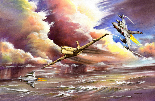 This is 'Storm Break', watercolour and gouache, and represents my second experiment in 'body colour'. Body colour was popular in watercolour back in Turner's day, when it became a mainstream movement. It stemmed from the introduction of Chinese White, which is a very bright and opaque medium which could be mixed with watercolour to provide opacity. At its most extreme, it was used by watercolourists to both provide a highly reflective underpainted surface, and as body colour within the watercolours, which together could result in a watercolour which had more the appearance of an oil painting than a watercolour. Here, I've simply used permanent white gouache to strengthen some of the colour in the storm clouds, and to join the white colour of the cloud edges, which is a mixture of unpainted white paper and touches of gouache, with the transparent watercolour of the cloud darks. By doing so, I have tried to model the clouds lights, darks and shapes in a little more detail than I could achieve with a simple watercolour wash. I rather like the effect! The aircraft and the water have been painted conventionally for watercolour, with some of the wave crests highlighted with gouache to match the cloud treatment. The use of body colour and gouache is frowned upon by some watercolourists who consider that all watercolours should be transparent. I love watercolours of all sorts and transparent watercolours can be beautiful. However, the likes of Turner showed that there was no need to restrict ourselves, as artists, in the media we use. In this painting, I wanted these effects, so I used some body colour. As long as the results are pleasing and permanent so that the overall painting is as durable as the permanent watercolour, I really see no reason to be restrictive. There are plenty of rules in this world - so I'm delighted that there are no rules in art! 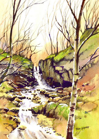 It's amazing what you come across when you're least expecting it. Although these waterfalls are only 10 miles from my home, I had never heard of them. I had dropped my wife off for a meeting at work and thought I'd spend the time I had to wait for her walking my dog in some nearby woods. After about ten minutes walking, I heard the unmistakable sound of fast-running water and suddenly there they were. As soon as I saw this view, I just knew I'd have to paint it!
This is 'Spring Dawn, Falls of Tarnash, Keith', watercolour, 24 x 34 cm. In this painting I wanted to do more than just paint the waterfall. I wanted to convey the contrasts I saw between the massive solidity of the rock and the gentle glow of the ephemeral woods. I wanted to convey the contrast between the stillness of the damp trees and the constantly flowing water. And most of all I wanted to make you feel intimate with the landscape, that you could reach out and touch the tree, hear the water and feel the crisp morning air. I hope you enjoy experiencing my surprising find! 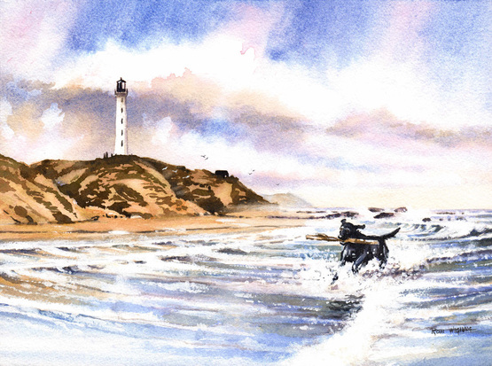 I don't normally take on pet 'portraits', as it's really not my 'thing', but this one was a bit irresistible! The customer has walked along this section of beach with her dog on lots of occasions and wanted a painting of him in his element - carrying sticks from the water of the beach below Covesea in northern Scotland. It's a beach I know well, and have painted before, and I was attracted to the possibilities of splashing in the bright,clean water. So the dog is tearing out of the surf with a big stick, making plenty of splash. I hope I've caught the essence of him, if not the detail, and I enjoyed the unusual angle of placing the viewer in the sea with him! hopefully you can feel the surf and the sunshine in 'Blue Skies and Happy Days!'
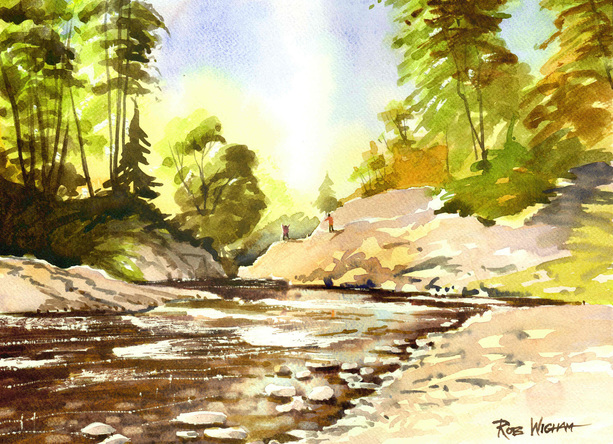 Sometimes detail is not required. In fact, sometimes detail would undermine a painting. This is 'Randolph's Leap', watercolour, 35 x 25 cm. It is at a point where the River Findhorn is at its narrowest, and the rock formations get quite close together. Its name comes from a chase, where one group of men were chasing another during Scotland's tribal past. The man knew that if he didn't get across he would be killed by his pursuers. So, with little to lose, he leapt, and got away. Perhaps the most surprising element of all this was that the man's name that made the leap was not called Randolph. In fact, Randolph was doing the chasing, and this is just another example of how history is written by the victors!
In any case, it's a beautiful area and a wonderful spot to spend the day. Located in Moray, in northern Scotland, it's not a busy spot, despite its beauty. When I returned there to paint recently, I spent most of the day there with my wife and dogs who played in the water. In all that time we only saw a couple of families: the children playing on the rocks came as an idea from one of them. It's a spot which unfortunately would put off many painters - the scene is very complex, with hundreds of trees, lots of scrub and many, many rocks. But this is where watercolour comes into its own! By allowing the sunlight to simplify the undergrowth into a glowing haze of leaves, the scene has been simplified. Hopefully, the detail which might have been seen on the rock formations has been pleasantly replaced by another sunlit glow. It was an exercise in simplification, but also one in letting the light and atmosphere replace anything which might have detracted from the simple, luminous appearance. I hope you like it! |
AuthorA professional artist living and working in the beautiful north of Scotland. My work is realistic and quite traditional, though strongly interpretational in nature. My inspiration is the beauty of Nature, and the wonderful colours and moods she shows everywhere. Archives
April 2022
Categories |

 RSS Feed