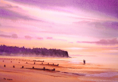
 I hope that this painting is an example of saying more with less. Sometimes skies are so beautiful and eye-catching that I can't resist painting them. But the clouds are constantly changing and usually very complicated - which wouldn't work in a painting. In this picture, I've simplified the skies and smoothed them out to create what I hope is a serene, mellow atmosphere. I've deliberately lost a lot of detail on the land, too, saying just as much as necessary to create a simple but beautifully compelling scene. So here is 'Mellow Sunset over Findhorn Beach', watercolour, 34 x 25 cm. Both the original and prints are available - please see my Coastline Gallery for details or just click on the picture.
1 Comment
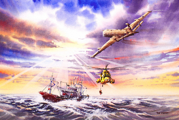 The Royal Air Force's Nimrod MR2 Log-Range Maritime Patrol aircraft, as well as the Sea King search and rescue helicopter, make a welcome return in my latest painting: 'Top Cover', watercolour, 53 x 34 cm.
The scene was painted as a commission based on the customer's memory of his participation in this rescue. The sky and the sea-state are as they were, and the ship is the actual ship involved. The Sea King is winching an injured trawlerman to safety for the transfer back to hospital in Cornwall, some 200 miles away. At this distance, the Sea King is at the very limit of its range and far out to sea, so the Nimrod is flying a 'Top Cover' mission to assure the safety of the helicopter. A Nimrod, loaded with a bomb-bay full of dinghies and search and rescue apparatus was on standby every day of the year at RAF Kinloss and these missions were common, although not always in this beautiful weather! The Nimrod will stay with the Sea King until it makes landfall near Land's End, then depart home to RAF Kinloss in northern Scotland to resume its standby. In my past career I have flown many search and rescue missions on the Nimrod, but the real heroes here are the helicopter crew, and especially the man or woman on the end of the rope. These people put themselves and their helicopters in some very risky places in some atrocious weather and seas. In this painting I wanted to convey this, with its focus on the rescue itself, as well as the huge combined effort which has gone into bringing this injured man to safety from far out to sea. I hope you like the result - a limited edition of 100 prints are available. Please see my aviation gallery for details. As a watercolourist, I am focussed on colour. It's a complex subject, and I put a lot of work into ensuring my colours have the right degree of warmth and contrast with their neighbours. But not everyone wants colour. This is 'Elgin Cathedral', painted as a commission to match a collection of monochrome images: 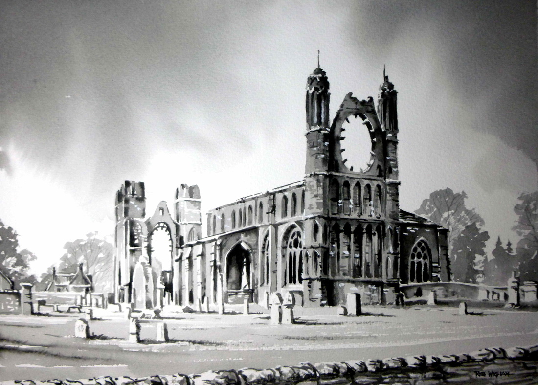 I'd never painted in monochrome watercolour, although I've worked in pen and ink a lot in the past. I bought in a new colour for me - lamp black. Normally, I mix my darks, and I've never had any use for black. I usually prefer the colour harmony you can achieve with mixed darks in a colour setting. Lamp Black was quite a surprise - it produced an effect just like water soluble graphite but, unlike most watercolours, it can't be removed (at all!) once its been applied to the painting. Most watercolours, apart from heavy stains, can at least be faded if you get something wrong - not this colour! As it happens, it didn't matter, as the painting went very well. I came out beautifully (IMHO!) in fact, and I'm pretty sure there'll be more paintings like this in future. Now, here's another commission in colour: 'Romany Morning'. 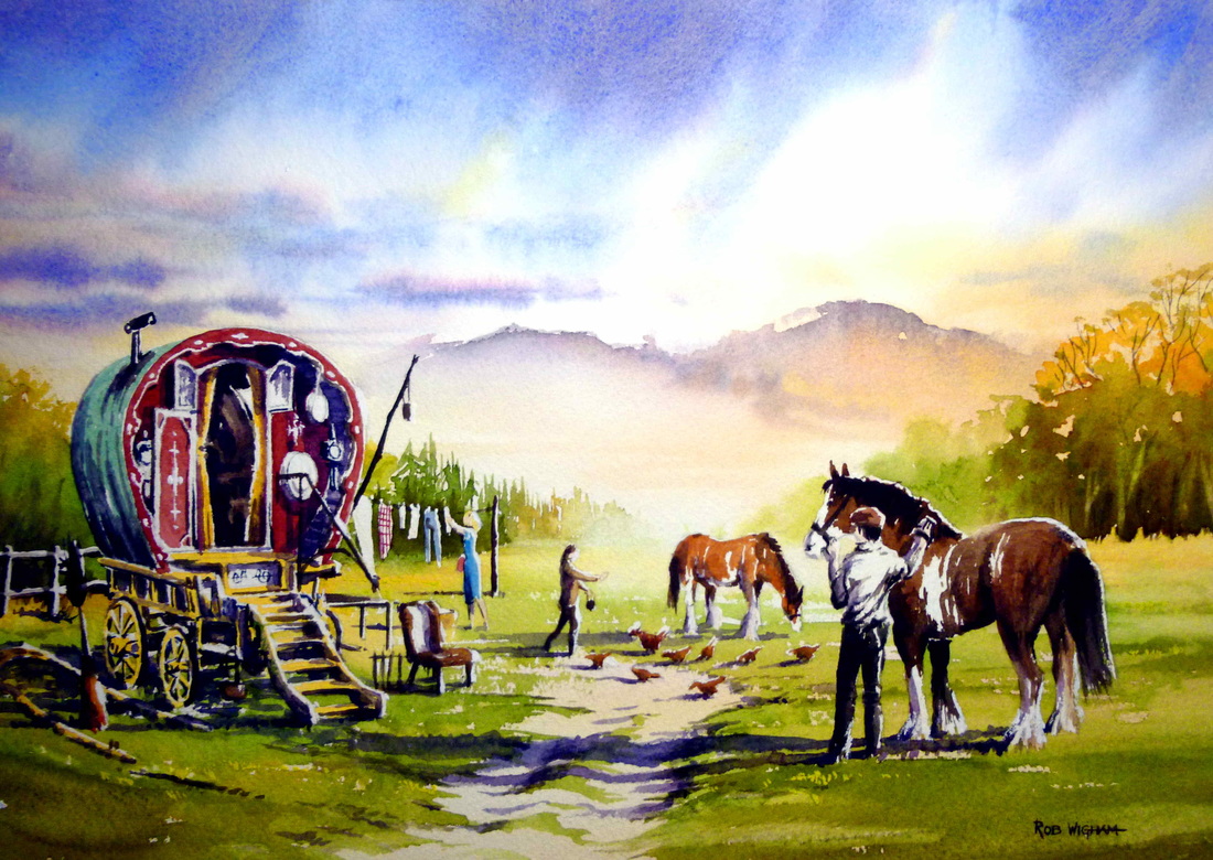 In this painting, which was commissioned to show the details you can see in the foreground, I also wanted to portray a sense of the outdoor life, and sense of space - and places to roam! I have deliberately lost the 'distance' to atmosphere. There are a million places you could go from the gap between the trees! I also enjoyed painting the horses and the detail of the caravan and this domestic scene.
So, did I prefer the colour, or the monochrome painting? Actually, I loved doing both. Colour allows more options as a painter, giving the opportunity to use colour contrast to give depth and life. Monochrome produces a considerable challenge, where only tone can be used for these things. I like to think they both have atmospheres of their own - and I'm happy with the results of both! There'll be more black and white, I'm sure, but there'll also be plenty of colour! |
AuthorA professional artist living and working in the beautiful north of Scotland. My work is realistic and quite traditional, though strongly interpretational in nature. My inspiration is the beauty of Nature, and the wonderful colours and moods she shows everywhere. Archives
April 2022
Categories |
 RSS Feed