|
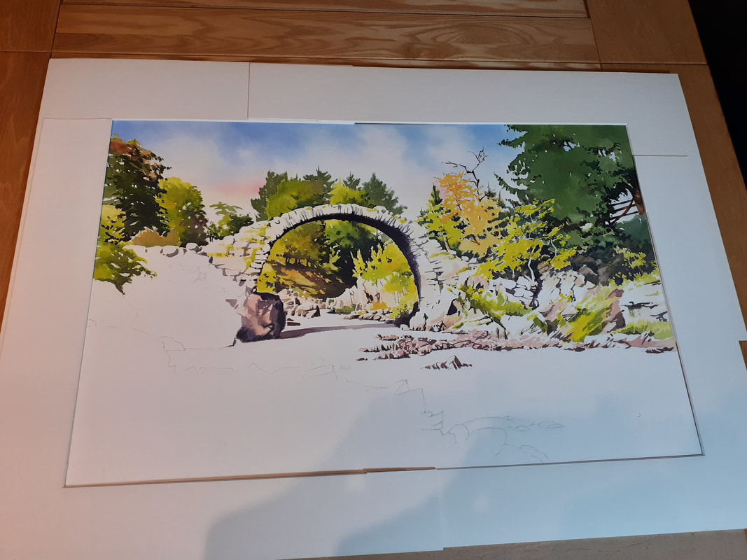
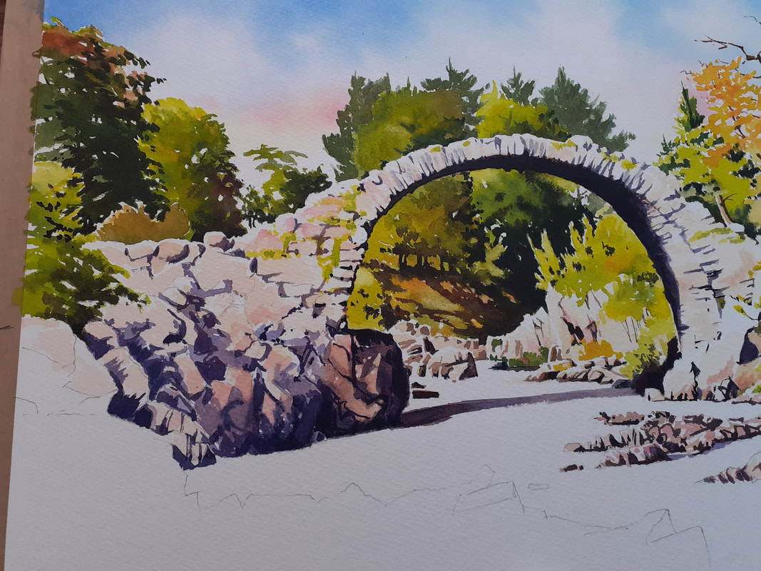
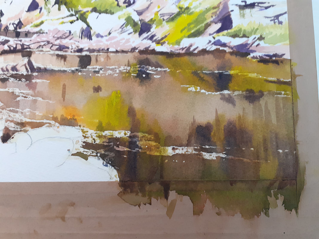
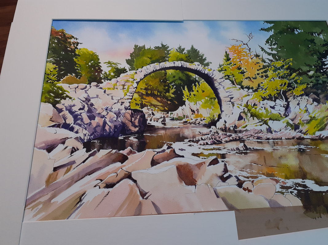
When we last looked at this painting we had completed the background. Now to crack on with the bridge and foreground! The most important element with the bridge and the foreground on the right is to maintain the light - so the first step to completing these elements is a very light wash to apply some colour without applying 'darkness'. The rock of the bridge, in real life, is a flat grey colour. This won't work in the painting, so to suggest warm sunlight across the scene we'll use a weak wash of warm raw sienna with a hint of the red colour in the sky - permanent rose. I followed this light wash with some shadows too. Here's the result of those first washes across these areas: I carried this on with the rocks to the left. These rocks, in reality, are in deep shade, but this would be too dark. So I've used a bit of license to keep some light on them: Now it's time to tackle the elephant in the room: the water. The pic above looks very weird, doesn't it? It's because the white is 'flat' as much as anything. So it was important to make sure that the water looks like a moving, active thing. To do this, I'm going to use a pencil to pull some lines of movement through the water then apply some masking fluid (liquid rubber) to the paper over them. These continuous lines will (I hope!) tie the body of the water into a single whole in the eye of the viewer. Once done, I then also mask the edges of the rocks, allowing a little overlap to allow a bright 'fringe' above the foreground rocks to suggest sunlight sparkling on the rocks. Now, I wet all the water area with clean water until the paper is soaking wet. This will keep the water area damp while I work, and allow washes to flow into each other, keeping the edges soft and natural in the water. Speed is of the essence here as once I start painting I have to finish before the paper starts to dry. I throw the dark washes into the wet area and stroke them into each other using primarily vertical brush strokes. The washes are very dark - partly to reflect the dark peaty colour to the water here in the Highlands but also to contrast with the lighter areas of land. Because the washes will dry lighter, I have to apply them really dark. It's a messy business! Once fully dry, I remove the rubber and then go back into the water areas with a scrubbing brush and a tissue to 'lift out' areas of light highlights where the bright rocks on the far side are reflecting. I also enhance some of the darks to make them darker where I think they need it Once finished, it's time for the foreground rocks. In real life they are incredibly complex, with lots of cracks and fissures, especially as the sun is from the side of the view and each crenellation casts a shadow! The effect, if I tried to copy it, would be to make the foreground rocks the main subject of the painting - and they aren't! So I'm going to simplify them a lot, with little more than some sunlit colours, a few big shadow areas, and a small amount of detail. I want to use them to draw the viewer into the painting and to make them look towards the bridge. So I'm going to highlight the lines in the rocks that help with that, and leave out the ones that don't: I'm going to leave it there - I have to do something to keep the suspense don't I?
All there's left to do is to add some detail to the foreground rocks and then fuss around the whole thing to refine details and make sure the tonal values are right. I'll hope to publish the finished thing tomorrow once I have a properly scanned pic that represents the original perfectly. I hope you've enjoyed the process, and I hope you like the painting when you see it soon! All the best, Rob.
1 Comment
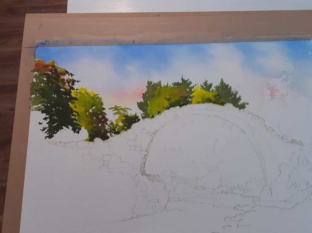
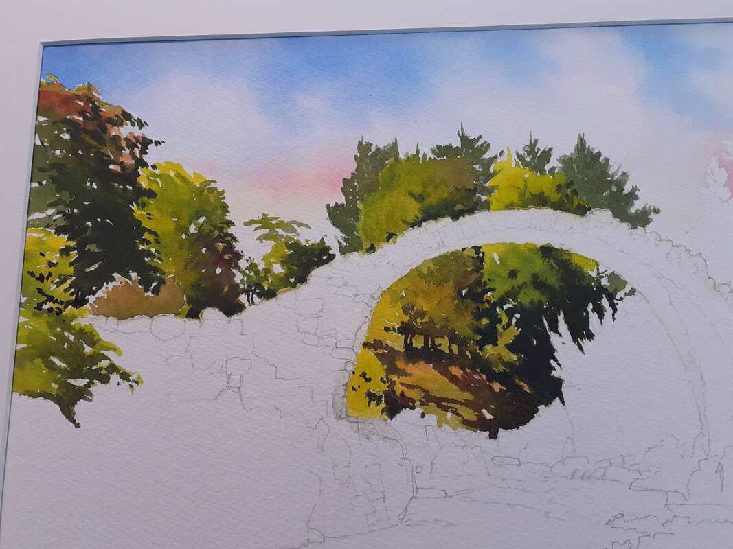
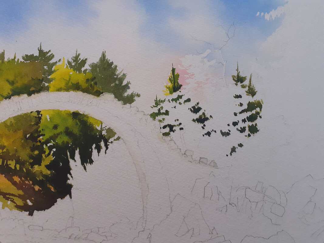
Managed to get a good crack at painting today, which was nice! Here we'll take the Carrbridge painting from just the sky painted to pretty much all the greenery finished! Greens are hard work because it's easy to end up with a whole painting of the same colour with little contrast or tone. Today involved a fair amount of mixing and testing to get what I wanted. The view above and through the bridge is pretty much just a sea of trees and it was important to make sure that there was plenty of light, colour and tone in play. I started out by masking the edge of the bridge so that I didn't have to worry about accidentally painting the stone of the bridge itself. Greens are notoriously staining and I didn't want to accidentally paint the bridge green! I started out by painting the trees above the bridge, ensuring that the lightest side was on the left with shade on the right: It looks weird like this, but will start to make more sense later. By the way, don't take the colours seriously, these are just quick snaps on my phone and the real painting's colours are different to these (although obviously they're fairly close!) I needed to get the greens above and below the bridge to match so I did them next: Now we get to see the idea of the painting, where the strong background colours and tones start to make the bridge stand out! Now, to set up a rhythm in the painting and give the appearance of complexity in the trees to the right of the bridge, I did a bit of 'negative painting' next: painting the dark background in first before adding the lighter colours in front. This is what it looked like at this stage - quite strange! At this stage I'd painted in more of the darks (apart from some shadows that you'll see beneath the tree at right) so it was time to paint in the sunlit elements. The painting will fail or succeed on the strength of the sunlit areas which are to come. All the colours so far are strong and often dark. To work, it needs some serious lights. In watercolour, these need to be exaggerated or 'pushed'. So the colours for the lights are generally thin (to allow tbe white of the paper to shine through) and very bright. The idea is to throw a big contrast between the darker areas and brighter, sunlit passages. For those interested, the greens here were largely based on sap green, lemon yellow, Payne's Grey and transparent yellow, with some raw sienna and burnt sienna for warmth. I also mix in a little of the sky red (permanent rose) to make the greens sit comfortably under that sky. For warmth in the rocks and sunlit areas I use predominately the warm glow of raw sienna. So, with most of the greenery in place now, here's where it's been left on my desk: 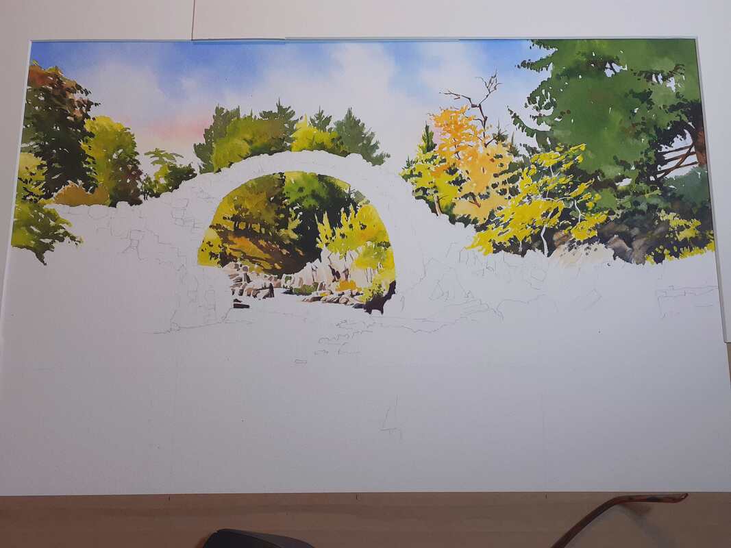 I hope that this will give enough brightness and contrast to give a strong background. I don't want too much detail, as I don't want it to compete with the bridge. Hopefully this will show it off - we'll see! I won't have much time for this tomorrow but hopefully I'll be back with more progress in a couple of days! All the best, Rob.
|
AuthorA professional artist living and working in the beautiful north of Scotland. My work is realistic and quite traditional, though strongly interpretational in nature. My inspiration is the beauty of Nature, and the wonderful colours and moods she shows everywhere. Archives
April 2022
Categories |
 RSS Feed