|
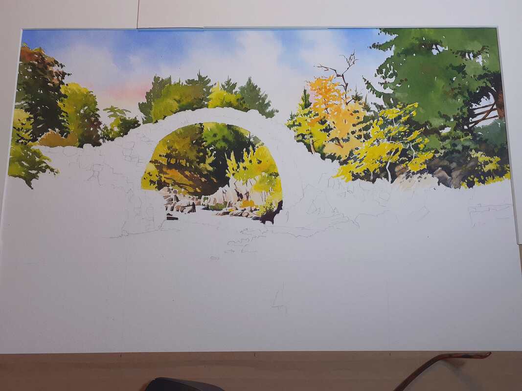
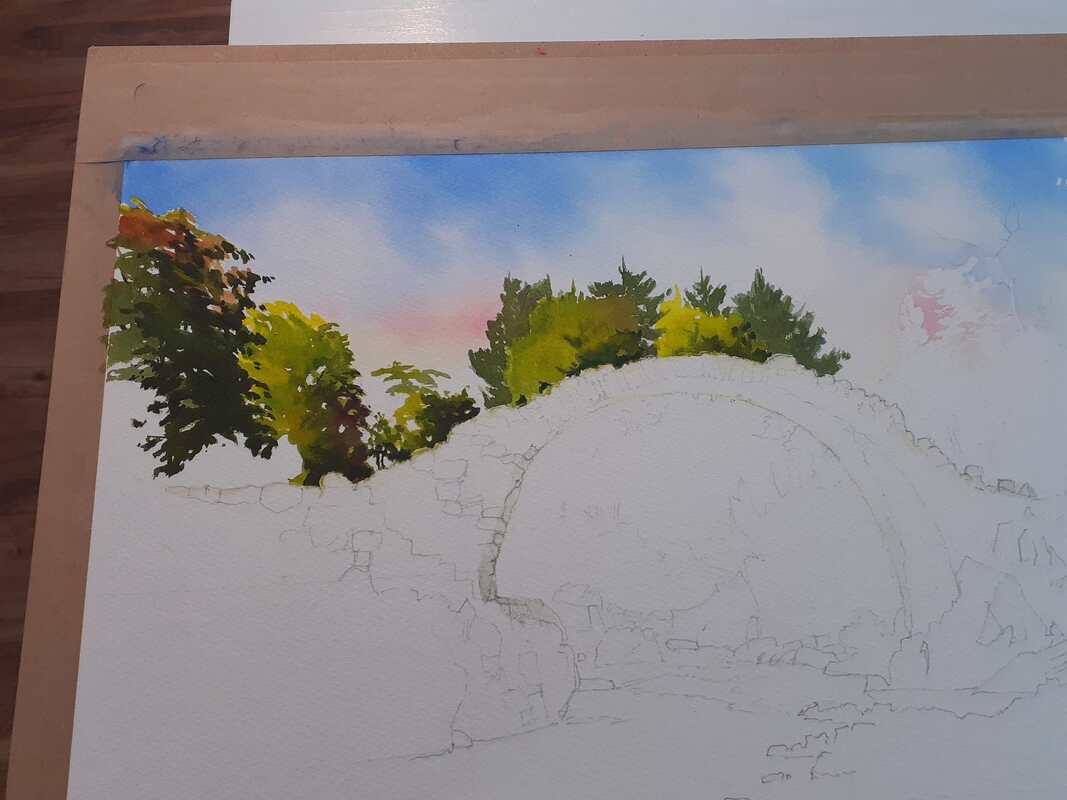
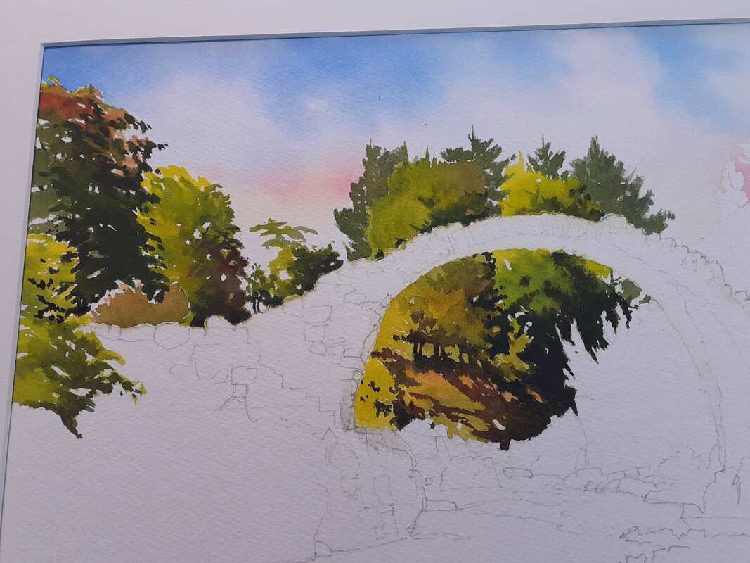
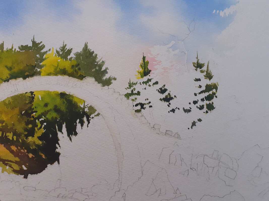
Managed to get a good crack at painting today, which was nice! Here we'll take the Carrbridge painting from just the sky painted to pretty much all the greenery finished! Greens are hard work because it's easy to end up with a whole painting of the same colour with little contrast or tone. Today involved a fair amount of mixing and testing to get what I wanted. The view above and through the bridge is pretty much just a sea of trees and it was important to make sure that there was plenty of light, colour and tone in play. I started out by masking the edge of the bridge so that I didn't have to worry about accidentally painting the stone of the bridge itself. Greens are notoriously staining and I didn't want to accidentally paint the bridge green! I started out by painting the trees above the bridge, ensuring that the lightest side was on the left with shade on the right: It looks weird like this, but will start to make more sense later. By the way, don't take the colours seriously, these are just quick snaps on my phone and the real painting's colours are different to these (although obviously they're fairly close!) I needed to get the greens above and below the bridge to match so I did them next: Now we get to see the idea of the painting, where the strong background colours and tones start to make the bridge stand out! Now, to set up a rhythm in the painting and give the appearance of complexity in the trees to the right of the bridge, I did a bit of 'negative painting' next: painting the dark background in first before adding the lighter colours in front. This is what it looked like at this stage - quite strange! At this stage I'd painted in more of the darks (apart from some shadows that you'll see beneath the tree at right) so it was time to paint in the sunlit elements. The painting will fail or succeed on the strength of the sunlit areas which are to come. All the colours so far are strong and often dark. To work, it needs some serious lights. In watercolour, these need to be exaggerated or 'pushed'. So the colours for the lights are generally thin (to allow tbe white of the paper to shine through) and very bright. The idea is to throw a big contrast between the darker areas and brighter, sunlit passages. For those interested, the greens here were largely based on sap green, lemon yellow, Payne's Grey and transparent yellow, with some raw sienna and burnt sienna for warmth. I also mix in a little of the sky red (permanent rose) to make the greens sit comfortably under that sky. For warmth in the rocks and sunlit areas I use predominately the warm glow of raw sienna. So, with most of the greenery in place now, here's where it's been left on my desk:  I hope that this will give enough brightness and contrast to give a strong background. I don't want too much detail, as I don't want it to compete with the bridge. Hopefully this will show it off - we'll see! I won't have much time for this tomorrow but hopefully I'll be back with more progress in a couple of days! All the best, Rob.
0 Comments
Leave a Reply. |
AuthorA professional artist living and working in the beautiful north of Scotland. My work is realistic and quite traditional, though strongly interpretational in nature. My inspiration is the beauty of Nature, and the wonderful colours and moods she shows everywhere. Archives
April 2022
Categories |


 RSS Feed