|
Last post we painted the sky and the distant headland of this scene. This time we're going to take over from where we left off, painting the seas and starting the village and harbour itself. I'll try to keep it as brief as I can - if I miss something and you'd like to go into more detail, please let me know! 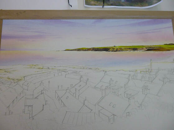 The first thing to do is to re-establish the washes used for the sky and underpaint the water area. For this I masked out the white wave areas first around the harbour and rocks, then re-wet the water area with clean water. I then laid in the sky washes, upside-down and stronger than the sky itself (because the blue water washes will mainly cover these colours up). This underpainting means that the blue 'sea' wash will take on these underlying colours and sit naturally beneath the sky. Next, I masked the surf breakers themselves. Masking after doing the underpainting means that the 'whites' of the surf will show subtle sky colours - a good thing! I use a very small round brush for this as masking can appear quite clumsy when the fluid is removed, and any masked mark ends up being twice as big as you thought it would be! Finally, I mixed the washes for the sea. The first was a pure ultramarine blue. Initially it wasn't too strong, as it would be used for the distance. I would strengthen it with pure pigment as we came nearer the shore. Next, I made a wash of Pthalo blue (green shade) for the shallower water. As usual, where I can I like to make pure washes and mix them on the paper - I think it keeps the colours brighter! The painting of the water doesn't take long at all - the first aim is to cover the area with colour. I lay the blue washes in, fainter at first, by the horizon, strengthening them as they come closer. Before I get to the shallows, I start to add Pthalo blue. All this is done with a loaded round brush with long horizontal strokes, working down the dry paper. As I reach the shallows, I start to add both raw sienna and rose madder. I need to be careful here, as adding these colours can make the wash thick and dark - the opposite of what the water should look like! The secret is to keep them light, and stretch the colours across the white paper to keep them bright. I drop a few more strokes of stronger colour here and there and let it dry, before removing the masking fluid from the surf areas. Now it's time to add some harbour walls and rocks. These are done on dry paper, with strong washes of yellow ochre first (as an underpainting to suggest sunlit areas)), shadow colour made from blue, madder and burnt sienna for shadow colour (again as an underpainting) and then some raw and burnt umber added over the top for the solid shapes. The result, with some nice contrast with the white surf, is shown below (please bear with the dodgy photos, they're done as a quick sideline during the painting with no thought for lighting etc): 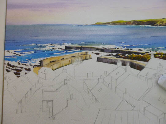 To paint the water in the harbour, we'll exaggerate the difference between the rough waters of the breakers and the smooth water of the harbour - so reflections become important. I mask around the houses and the boat, then paint in the harbour with a light sky blue of ultramarine with a little rose madder. With that still wet, I start adding the dark harbour colours , plus a fair amount of dark green (sap green plus burnt sienna) to the water below the walls - leaving a white gap where the boat is. This runs softly into the water, becoming diluted but leaving soft edges. I keep adding the pigment until the reflections are dark enough. While the area is still wet, I flood in some red under the boat, having masked a few white areas for bright reflections: 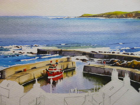 Phew! That's the water done. Maybe it's my background, worrying about watercolour skies and the difficulty of painting water, but at this point I always feel like the painting's going to work: the difficulties and 'unknowns' are behind me! At this point I generally clean all the palettes and refresh all the blobs of paint to get ready for the land. I do the roofs first. To do the roofs, I use 3 colours: ultramarine, rose madder and some burnt sienna. These three colours will give blues, pinks and greys in enough variety to make a rich set of roofs. Some of them are red (clay) tiles, of course, and then a mix of light red and raw sienna works well. I also need to colour in the chimneys and clay apex tiles in raw sienna, occasionally with dabs of light red and rose madder. Before I apply the colours I apply shadows as before. It's always best to apply shadows first, otherwise the shadow colour will blur the detail later. All through the painting process, I need to remember that the light is coming from the right, so I leave a small line of white paper unpainted to indicate the twinkle of light on the right side of every object. If that sounds complex, once you get used to it, it becomes second nature (honest!) So this is where we've got to! 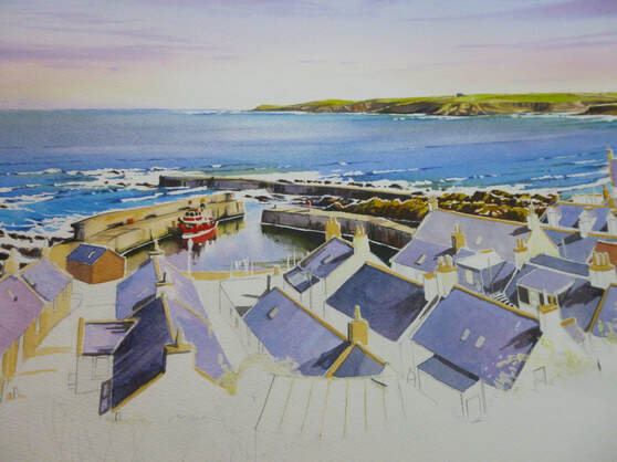 OK, we've covered a lot of ground, and we only need to add the bodies of the houses, foreground and detail to finish. For now, treat yourself to a glass of wine (I did!) and we'll finish it next time. Thanks for hanging in there - see you soon, Rob.
3 Comments
I promised to give a step-by-step of one of my paintings soon, and for once I remembered to take photographs at each stage of my 'Sandend Harbour from the Brae'. The painting was painted at a size of 53 x 35 cm and done from a collection of sketches I made recently on the path above Sandend village. I also took some reference photographs but, as usual, I tried to make minimal use of them. I find that I produce better paintings when I work from my sketches, so I only use the photos when I need a reminder of something I haven't covered in the sketches. So for this post and the ones that follow, I'm going to skip those stages and go straight to the painting, doing a bit at a time until we've finished the whole thing! A piece of the cotton 'paper' I use, Saunders Waterford Hi White 640g was stretched and I then drew a grid of lines lightly across it, dividing the paper into quarters. I do this to transfer my final layout sketch onto the full-size painting. I lightly draw in the main lines of the painting by eye from the layout sketch: 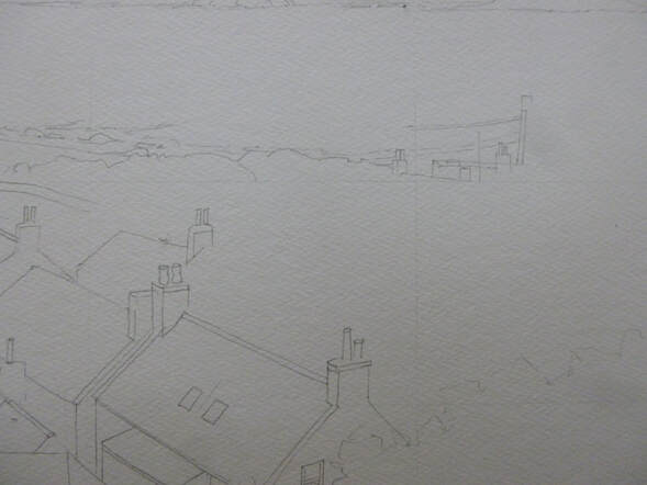 Had I been cleverer, I would have remembered to only do the top half of the painting's drawing at the start. I always get carried away and draw the whole picture out, but this has the disadvantage of resulting in lots of smudged pencil as I work on the painting. Much better to restrict it to the top half and draw the rest in once the top is painted! On to the painting. I usually do the sky first and then work down the painting. This isn't always the case, but I find it easiest to work on the paintings a section at the time. To paint the sky, I mixed some washes first. Things happen fast when working wet-in-wet, so it makes life a lot easier to have washes ready mixed first. I mixed a 50/50 wash of lemon yellow and raw sienna. This is to produce a warm yellow at the bottom of the sky; the lemon yellow serves to keep it bright. I also mixed a wash of rose madder. I know it fades as it dries, so this wash looked stronger than the yellow one. A blue wash of light ultramarine finished the main sky colours; I also mixed a stronger purple from the blue and rose for the clouds. With the washes ready, I masked the top of the sea with a piece of masking tape then washed clean water all over the sky area. On this thick paper, it took a few lashings of water to get it properly wet. I like the heavy paper as it stays moist for a long time, allowing me time to add extra details at leisure (a thin paper dries faster and everything becomes a race against time). It is also good for demonstration work as I can chat about what I'm doing as I go, without fear of the wash drying on me. Incidentally, the reason I wet the paper first is so that there are no hard edges, with the sky colours mixing and spreading across the damp paper. With the paper wringing wet, I use my 3/4" flat brush to lay in a light wash of yellow at the base of the sky, just above the land and sea. It will run down on the gently tilted board but will be very weak when it reaches the bottom, preserving a light glow just above the horizon. I need to consider preserving the painting's 'inner light' at all stages and in everything I do! I keep strengthening the yellow until it looks just a little too yellow: it will fade a little as it dries, so most colours need to be put on stronger than I want them. The colours are also diluted by the water on the paper, which contributes to the fading. Happy with the yellow, I apply the red - again with slashing horizontal strokes - keeping away from the area of light at the headland, which I leave as white paper to produce the 'glow'. The red fades more than the yellow so as I apply it I have to keep that in mind and apply a strong band of red. I work it into the yellow with slashing x-shaped strokes across the paper to achieve a blend from yellow through orange into the red. A clean of the brush and I do the same thing with the blue, laying it into the top of the red and working up the paper. The first wash of blue is quite weak as the colour isn't strong low down in the sky. As I go up towards the top I add a little more pigment to the wash to strengthen the colour with each new stroke. The background colour of the sky is complete! It's now time to do the clouds but the paper is still wringing wet. If I applied the cloud colour when it was too wet, the colour would spread too far in the sky and just make it dull. I want it to spread to avoid hard edges to the cloud, but not too far! So I wait for a few minutes until the paper is just a little less wet but still good and moist. Then, using the flat brush again but turned at an angle so that it will produce thin marks, I stroke in the clouds. It's important to make sure that the cloud colour is strong and dark enough to stand out against the sky behind, but at the same time not so strong that it makes the sky dark. In this painting the sky needs to be light, or the overall painting will appear too dark, so I kept the clouds as light as I could. Compositionally, it's also a good idea, in a 'busy' painting like this one, to keep the sky simple. And so it is! 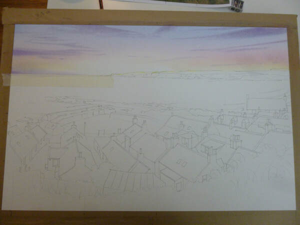 The next stage was to paint the headland. I mixed a wash of sap green, knocked back with a little raw sienna to make is a more realistic colour and another wash of stronger neat raw sienna. With a pointed round brush of size 8, I then painted the green colour strongly along the top of the headland and the raw sienna along the bottom, down to the waterline. This produces a wet-in-wet mix as the green at the top mixed with the yellow. While that dried, I added some lemon yellow to brighten the green in places and once it was just moist, I started to add burnt sienna into the rocky areas to give it that red colour. I kept adding this as the headland dried, which allowed me to gradually add shape to the land. This is a useful method because, as I don't have total control of the pigment, I can suggest detail without actually painting it. Finally, I added some of the blue to the burnt sienna together with a little of the rose madder to make a shadow colour which I applied into the red-brown areas. At this stage the headland was dry, so the final shaping was done with progressively darker mixes of the shadow colour, until it was almost black: 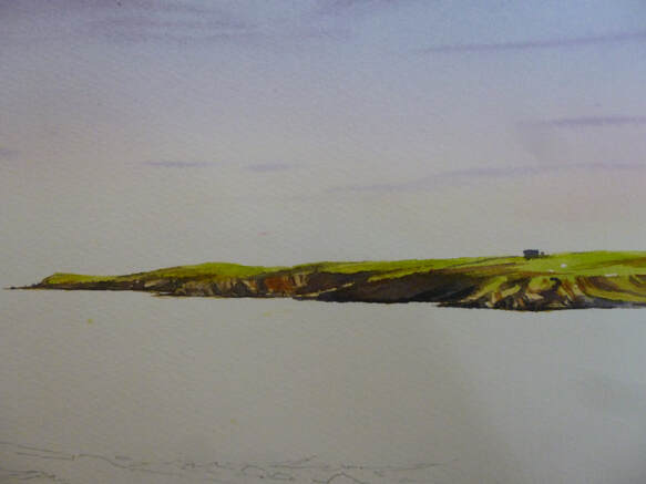 I'm going to leave it there for this post to avoid it getting over-long. If all the words give the impression that the painting took a long time, it didn't. The actual painting work so far took only about half an hour - it just takes a lot of words to describe it! I hope you enjoyed the start to the painting - next time we'll be painting the sea and making a start on the houses! All the best for now, Rob. So having promised over a year ago to write more blog posts, I seem to have written very little! I promise to rectify that now, and produce more posts both on our work and some of the things behind it. I've been asked a few times to show some of the equipment that I use to paint - so for an opening blog, here goes! The stuff in the picture below is almost everything I use to produce my paintings; there are a couple more brushes and lots more paint colours in my collection, but these are a good sample. Today I'll start with the paints and come back to the brushes in another post. 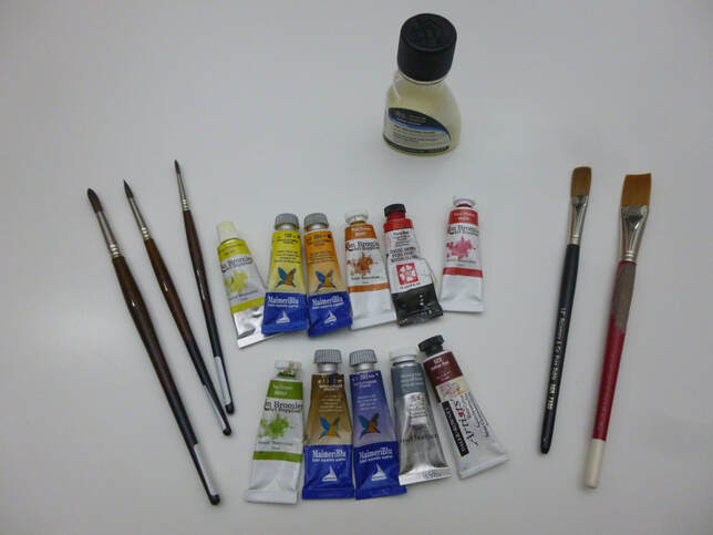 As you might imagine, my paints are pretty important to me. After the paper, I think they're the second most important element of equipment a watercolourist needs, so let's have a quick look through my paint drawers! They're all artist's (professional) quality pigments, which means that they're very finely ground minerals which produce a consistent wash and they're made from high quality ingredients. All the pigments are classified either lightfast or very lightfast, as this is important to me: I sell my work and the customer deserves the best and lasting quality. As you can tell, I don't have any loyalty to any particular manufacturer and there are a reasonable selection here. If I had to choose a particular favourite range of paints it would probably be MaimeriBlu, a range made in Italy and not as common as some in the UK. These colours are very pure, quite strong and very beautifully ground. They include my favourite-ever pigment which is light ultramarine - shown at centre on the bottom row. I love that azure blue which has not a hint of grey. To see it properly you'd need to own one of my originals and, chances are, if it's a blue sky then that's it - I use it whenever I can! As you'll see, MaimeriBlu makes up quite a lot of my range. Now, I'm a great believer in the fact that a big name doesn't guarantee good quality; all my paints have passed my own tests for quality and usability and you might notice from the photo that some of them come from the Ken Bromley range. These are of surprisingly good quality, considering that they're an 'own-make' from a big UK online art shop. I find that they are very good for many of my colour palette; where I buy more expensive paints it's because they have a special quality that I value. As you'll see here, three of my staples (raw sienna (a lovely warm yellow), rose madder (a gentle pink) and sap green (an unnaturally vivid green) come from the Ken Bromley range. Where you see purples in my skies they will usually be a mixture of light ultramarine and rose madder. Rose madder is an old-fashioned colour which has more subtlety than strength. It makes a lovely pink on its own and gorgeous purples when mixed; the old formulation was fugitive (ie not lightfast) but the modern formulation means that this lovely colour is a responsible choice for those that sell their work. I mentioned that sap green was an unnatural colour, so why do I use it? The answer lies in the fact that it can be mixed with a variety of other colours to mix a wide variety of greens. The same applies to my other two greens: Hooker's Green and viridian. Also shown in the pic (fourth from left, bottom row) is Payne's grey - this time from the Windsor and Newton range. This is a dark grey with a blueish tinge and is there because, in paintings with lots of greens, it's another good way of mixing warm but different greens. I find it goes extremely well with transparent yellow to produce a range of greens that run from a yellow sickly-green to a rich dark green. Again, this basic mix can be changed by the addition of a third colour, such as a red to produce a warm and luxuriant green or burnt sienna to produce a rich dark. There are lots of ways to make greens, but sap green-based, viridian-based and Payne's Grey-based are my favourites. The variety helps to keep interest in a large are of greens such as were included in my recent painting 'Craigmin Bridge'. The two colours I use most for greys and blacks are burnt sienna and burnt umber which, when mixed with blues give a flat grey. An artist's definition of a grey is something along the lines of a mix of opposite colours on the colour wheel, which means there are many greys which can be used, depending on their setting in the painting. Whichever you use, the addition of this flat grey will make it darker, and I find it convenient to use that method often within a painting. A dense black can also be made by mixing Indian Red (at bottom right from the Daler Rowney range) with a dark blue such as Indigo. The last ones of the colours above are those I use for highlight colours - often the brightly-dressed people in my paintings! There's Pyrrol Red from the Daniel Smith range (I have quite a few more reds from various manufacturers in the range) and the incredibly versatile lemon yellow (here by Ken Bromley but also by MaimeriBlu). Lemon Yellow is perfect for suggesting sunlight by intensifying greens and for underpainting areas of ground that will be sunlit when overpainted. So there you have a quick canter through my pigments and a little bit about how I use them. I hope you enjoyed it and found it useful! I have a lot more colours than the ones mentioned here (I mentioned earlier that I have 2 drawers-full, totalling about 60 different colours) but the ones I've discussed here form a backbone of my palette. Indeed, it's often best for colour harmony to restrict the number of colours in a painting to just a few - so I usually end up using just a few at a time. One of the most important things about watercolour is to understand how your colours mix with each other and using a limited palette is a good way to learn! OK, in a future post I'll come back to brushes, paper and other bits and pieces. Before that, though, I hope to get together a walk-through of how I produce a painting from beginning to end over a few blog posts. The painting is almost complete on my board, and for once I've remembered to take photos at every stage! I hope you'll see the painting very soon and the blog not long after! All the best, for now, Rob. |
AuthorA professional artist living and working in the beautiful north of Scotland. My work is realistic and quite traditional, though strongly interpretational in nature. My inspiration is the beauty of Nature, and the wonderful colours and moods she shows everywhere. Archives
April 2022
Categories |
 RSS Feed