|
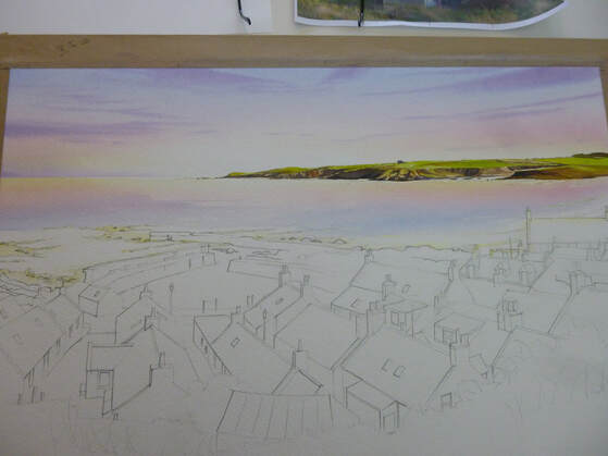
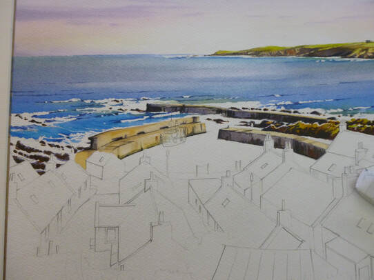
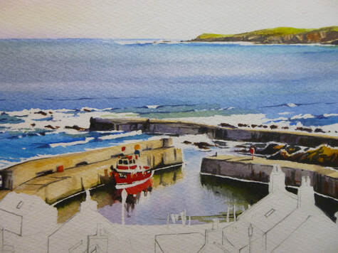
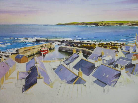
Last post we painted the sky and the distant headland of this scene. This time we're going to take over from where we left off, painting the seas and starting the village and harbour itself. I'll try to keep it as brief as I can - if I miss something and you'd like to go into more detail, please let me know! The first thing to do is to re-establish the washes used for the sky and underpaint the water area. For this I masked out the white wave areas first around the harbour and rocks, then re-wet the water area with clean water. I then laid in the sky washes, upside-down and stronger than the sky itself (because the blue water washes will mainly cover these colours up). This underpainting means that the blue 'sea' wash will take on these underlying colours and sit naturally beneath the sky. Next, I masked the surf breakers themselves. Masking after doing the underpainting means that the 'whites' of the surf will show subtle sky colours - a good thing! I use a very small round brush for this as masking can appear quite clumsy when the fluid is removed, and any masked mark ends up being twice as big as you thought it would be! Finally, I mixed the washes for the sea. The first was a pure ultramarine blue. Initially it wasn't too strong, as it would be used for the distance. I would strengthen it with pure pigment as we came nearer the shore. Next, I made a wash of Pthalo blue (green shade) for the shallower water. As usual, where I can I like to make pure washes and mix them on the paper - I think it keeps the colours brighter! The painting of the water doesn't take long at all - the first aim is to cover the area with colour. I lay the blue washes in, fainter at first, by the horizon, strengthening them as they come closer. Before I get to the shallows, I start to add Pthalo blue. All this is done with a loaded round brush with long horizontal strokes, working down the dry paper. As I reach the shallows, I start to add both raw sienna and rose madder. I need to be careful here, as adding these colours can make the wash thick and dark - the opposite of what the water should look like! The secret is to keep them light, and stretch the colours across the white paper to keep them bright. I drop a few more strokes of stronger colour here and there and let it dry, before removing the masking fluid from the surf areas. Now it's time to add some harbour walls and rocks. These are done on dry paper, with strong washes of yellow ochre first (as an underpainting to suggest sunlit areas)), shadow colour made from blue, madder and burnt sienna for shadow colour (again as an underpainting) and then some raw and burnt umber added over the top for the solid shapes. The result, with some nice contrast with the white surf, is shown below (please bear with the dodgy photos, they're done as a quick sideline during the painting with no thought for lighting etc): To paint the water in the harbour, we'll exaggerate the difference between the rough waters of the breakers and the smooth water of the harbour - so reflections become important. I mask around the houses and the boat, then paint in the harbour with a light sky blue of ultramarine with a little rose madder. With that still wet, I start adding the dark harbour colours , plus a fair amount of dark green (sap green plus burnt sienna) to the water below the walls - leaving a white gap where the boat is. This runs softly into the water, becoming diluted but leaving soft edges. I keep adding the pigment until the reflections are dark enough. While the area is still wet, I flood in some red under the boat, having masked a few white areas for bright reflections: Phew! That's the water done. Maybe it's my background, worrying about watercolour skies and the difficulty of painting water, but at this point I always feel like the painting's going to work: the difficulties and 'unknowns' are behind me! At this point I generally clean all the palettes and refresh all the blobs of paint to get ready for the land. I do the roofs first. To do the roofs, I use 3 colours: ultramarine, rose madder and some burnt sienna. These three colours will give blues, pinks and greys in enough variety to make a rich set of roofs. Some of them are red (clay) tiles, of course, and then a mix of light red and raw sienna works well. I also need to colour in the chimneys and clay apex tiles in raw sienna, occasionally with dabs of light red and rose madder. Before I apply the colours I apply shadows as before. It's always best to apply shadows first, otherwise the shadow colour will blur the detail later. All through the painting process, I need to remember that the light is coming from the right, so I leave a small line of white paper unpainted to indicate the twinkle of light on the right side of every object. If that sounds complex, once you get used to it, it becomes second nature (honest!) So this is where we've got to! OK, we've covered a lot of ground, and we only need to add the bodies of the houses, foreground and detail to finish. For now, treat yourself to a glass of wine (I did!) and we'll finish it next time. Thanks for hanging in there - see you soon, Rob.
3 Comments
Barbara Dougherty
23/2/2020 03:32:36 pm
thank you very much again Rob, so great, I missed the first one with the sky though. I will check on your page?
Reply
23/2/2020 05:17:03 pm
Thank you Barbara! I'm glad it's useful and I saw your FB comment that you had Part 1 as well. Part 3 won't be long!
Reply
Barbara Dougherty
24/2/2020 02:11:28 pm
You are just the best artist, Rob, I just love the soft colours you use and they work so well too.
Reply
Leave a Reply. |
AuthorA professional artist living and working in the beautiful north of Scotland. My work is realistic and quite traditional, though strongly interpretational in nature. My inspiration is the beauty of Nature, and the wonderful colours and moods she shows everywhere. Archives
April 2022
Categories |


 RSS Feed