|
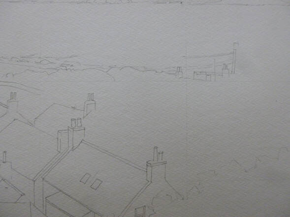
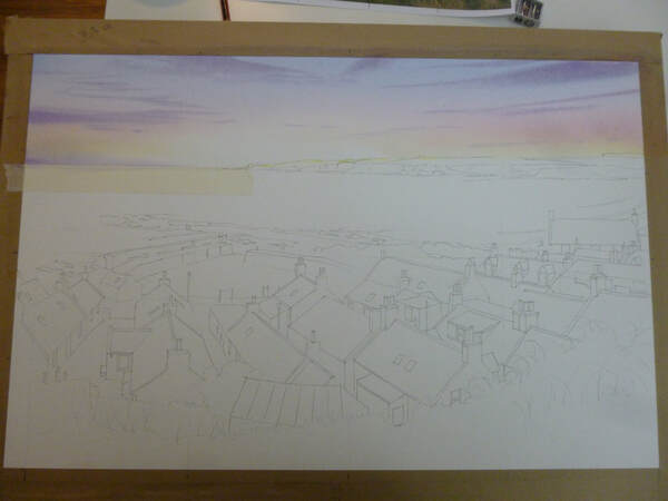
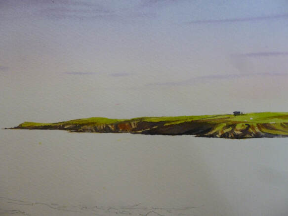
I promised to give a step-by-step of one of my paintings soon, and for once I remembered to take photographs at each stage of my 'Sandend Harbour from the Brae'. The painting was painted at a size of 53 x 35 cm and done from a collection of sketches I made recently on the path above Sandend village. I also took some reference photographs but, as usual, I tried to make minimal use of them. I find that I produce better paintings when I work from my sketches, so I only use the photos when I need a reminder of something I haven't covered in the sketches. So for this post and the ones that follow, I'm going to skip those stages and go straight to the painting, doing a bit at a time until we've finished the whole thing! A piece of the cotton 'paper' I use, Saunders Waterford Hi White 640g was stretched and I then drew a grid of lines lightly across it, dividing the paper into quarters. I do this to transfer my final layout sketch onto the full-size painting. I lightly draw in the main lines of the painting by eye from the layout sketch: Had I been cleverer, I would have remembered to only do the top half of the painting's drawing at the start. I always get carried away and draw the whole picture out, but this has the disadvantage of resulting in lots of smudged pencil as I work on the painting. Much better to restrict it to the top half and draw the rest in once the top is painted! On to the painting. I usually do the sky first and then work down the painting. This isn't always the case, but I find it easiest to work on the paintings a section at the time. To paint the sky, I mixed some washes first. Things happen fast when working wet-in-wet, so it makes life a lot easier to have washes ready mixed first. I mixed a 50/50 wash of lemon yellow and raw sienna. This is to produce a warm yellow at the bottom of the sky; the lemon yellow serves to keep it bright. I also mixed a wash of rose madder. I know it fades as it dries, so this wash looked stronger than the yellow one. A blue wash of light ultramarine finished the main sky colours; I also mixed a stronger purple from the blue and rose for the clouds. With the washes ready, I masked the top of the sea with a piece of masking tape then washed clean water all over the sky area. On this thick paper, it took a few lashings of water to get it properly wet. I like the heavy paper as it stays moist for a long time, allowing me time to add extra details at leisure (a thin paper dries faster and everything becomes a race against time). It is also good for demonstration work as I can chat about what I'm doing as I go, without fear of the wash drying on me. Incidentally, the reason I wet the paper first is so that there are no hard edges, with the sky colours mixing and spreading across the damp paper. With the paper wringing wet, I use my 3/4" flat brush to lay in a light wash of yellow at the base of the sky, just above the land and sea. It will run down on the gently tilted board but will be very weak when it reaches the bottom, preserving a light glow just above the horizon. I need to consider preserving the painting's 'inner light' at all stages and in everything I do! I keep strengthening the yellow until it looks just a little too yellow: it will fade a little as it dries, so most colours need to be put on stronger than I want them. The colours are also diluted by the water on the paper, which contributes to the fading. Happy with the yellow, I apply the red - again with slashing horizontal strokes - keeping away from the area of light at the headland, which I leave as white paper to produce the 'glow'. The red fades more than the yellow so as I apply it I have to keep that in mind and apply a strong band of red. I work it into the yellow with slashing x-shaped strokes across the paper to achieve a blend from yellow through orange into the red. A clean of the brush and I do the same thing with the blue, laying it into the top of the red and working up the paper. The first wash of blue is quite weak as the colour isn't strong low down in the sky. As I go up towards the top I add a little more pigment to the wash to strengthen the colour with each new stroke. The background colour of the sky is complete! It's now time to do the clouds but the paper is still wringing wet. If I applied the cloud colour when it was too wet, the colour would spread too far in the sky and just make it dull. I want it to spread to avoid hard edges to the cloud, but not too far! So I wait for a few minutes until the paper is just a little less wet but still good and moist. Then, using the flat brush again but turned at an angle so that it will produce thin marks, I stroke in the clouds. It's important to make sure that the cloud colour is strong and dark enough to stand out against the sky behind, but at the same time not so strong that it makes the sky dark. In this painting the sky needs to be light, or the overall painting will appear too dark, so I kept the clouds as light as I could. Compositionally, it's also a good idea, in a 'busy' painting like this one, to keep the sky simple. And so it is! The next stage was to paint the headland. I mixed a wash of sap green, knocked back with a little raw sienna to make is a more realistic colour and another wash of stronger neat raw sienna. With a pointed round brush of size 8, I then painted the green colour strongly along the top of the headland and the raw sienna along the bottom, down to the waterline. This produces a wet-in-wet mix as the green at the top mixed with the yellow. While that dried, I added some lemon yellow to brighten the green in places and once it was just moist, I started to add burnt sienna into the rocky areas to give it that red colour. I kept adding this as the headland dried, which allowed me to gradually add shape to the land. This is a useful method because, as I don't have total control of the pigment, I can suggest detail without actually painting it. Finally, I added some of the blue to the burnt sienna together with a little of the rose madder to make a shadow colour which I applied into the red-brown areas. At this stage the headland was dry, so the final shaping was done with progressively darker mixes of the shadow colour, until it was almost black: I'm going to leave it there for this post to avoid it getting over-long. If all the words give the impression that the painting took a long time, it didn't. The actual painting work so far took only about half an hour - it just takes a lot of words to describe it! I hope you enjoyed the start to the painting - next time we'll be painting the sea and making a start on the houses! All the best for now, Rob.
1 Comment
Barbara Dougherty
17/2/2020 07:24:30 pm
very great description, Rob, thank you. enjoyed
Reply
Leave a Reply. |
AuthorA professional artist living and working in the beautiful north of Scotland. My work is realistic and quite traditional, though strongly interpretational in nature. My inspiration is the beauty of Nature, and the wonderful colours and moods she shows everywhere. Archives
April 2022
Categories |


 RSS Feed